The Fallout Shelter Sign
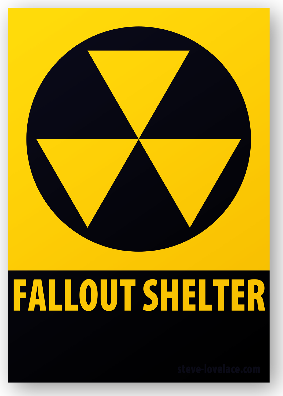

It is one of the icons of the Cold War: the fallout shelter sign. In an age where global thermonuclear war was just an inch away, the United States Government had to find a way to protect its citizens. To ease fears of nuclear annihilation, a Civil Defense program was established, introducing civic warning sirens, duck-and-cover drills, and public fallout shelters.
The Importance of Signs
The idea behind the fallout shelter sign was simple. In case of World War III, people could gather at these public shelters to avoid the worst of the nuclear fallout. As a kid born in the dying days of the Cold War, I always imagined these shelters to be quite elaborate, but in most cases, they were just basements and windowless rooms in existing government buildings. In many ways, the Civil Defense program was a lie. In truth, fallout shelter signs themselves were more important than the shelters.
From an artistic perspective, the fallout shelter sign is very well done. It is a simple geometric design that is easy to reproduce and easy to remember. Its black and yellow colors are made to be visible in low light. It’s the type of iconic imagery that, as a graphic designer, I can only hope to mimic.
A Constant Reminder of Death
But despite the aesthetic, the fallout shelter sign fails to communicate its core message. Remember, the Civil Defense program was a propaganda campaign. The whole point of fallout shelter signs is to tell the public, “Everything will be okay.” But with its sharp angles and jarring colors, the sign says the opposite. It is a constant reminder that death can strike at any moment, dooming as all. (It didn’t help that the triple triangle design looks an awful lot like the radioactive trefoil symbol.) Instead of calming the people, these signs kept Cold War-era Americans in a state of panic.
Today these signs are relics. Even though the world is still at risk from nuclear weapons, the panic of the Cold War has eased. In the age defined by terrorists and other non-state actors, emergency plans are a good idea. But we don’t need to get carried overboard. I thought about trying to design my own fallout shelter sign, one that would better communicate the idea of “shelter” to both English and non-English speakers. But I decided against it. The world doesn’t need more fallout shelter signs. It’s just another form of security theater. In the end, the fallout shelter sign is an example of good design used for the wrong application.


2 Responses
[…] was darker and gloomier than I expected. It wasn’t the kind of bunker where civilians took shelter in wartime; instead, it was a remote military research station. Back in its heyday, soldiers and […]
[…] extensive laboratory complex that looked like it was excavated in the chilliest days of the Cold War. An airlock at the bottom of the stairs had perfectly preserved it from the jungle above. I […]