Why I Love the London Tube Map
I love maps, as my many posts on this site make clear. It’s hard to pick a favorite, since there are so many maps in this world with so many designs and purposes. Still, if I had to pick, it would probably be the map of the London Underground. Affectionately known as the “Tube Map”, this is a diagram of all the subway lines in Greater London, as well as many other rail lines. (The modern map also includes trams, light rail and even a cable car.) I am far from the only person who loves this design, but the London Tube Map is popular for a reason. Let’s take a look at what makes it so endearing.
Creation of the London Underground
The history of the London Underground is a complex and interesting story that I don’t have time to tell here. Essentially, there was a huge rush to build railroads in Victorian Britain, but London was already too expensive and densely populated to but build surface-level tracks. Hence the first underground lines were built by several competing companies. Navigating these subterranean rails wasn’t always intuitive, since there were several competing networks. But by the early 20th century, the rail lines had started to cooperate and merge, and the first “Underground” branded map came out in 1907.
The First Tube Map
The first Tube Map was, well, a map. It was a fairly detailed representation of London with the train lines and rail stations overlaid over it. And it was kind of a mess. The lines were all squiggly, following the medieval street patterns of the City of London and its surrounds. In this spaghetti mess, the busiest stations in the urban core were all bunched together. This started to change in 1931, when a man named Harry Beck created a new design based not on a real world map, but an electrical circuit diagram.
Harry Beck’s Underground Map
Though he created one of the most iconic maps in history, Harry Beck wasn’t a cartographer. He was a draughtsman who specialized in designing circuits for the London Underground’s signaling system. By this time, electricians were using schematics to make sense of heaps of electrical wires, and Beck realized that he could do the same for the mess of Tube lines. In 1931, he submitted his idea to his boss, Frank Pick, at the Underground Electric Railways Company of London (UERL). Pick was skeptical but Beck persisted. In 1932, UERL printed just 500 copies of Beck’s map, and people loved it. The next year, UERL printed 700,000 copies, and the Tube Map became an both an icon of design and a commonplace item throughout London.
The Modern TfL Map
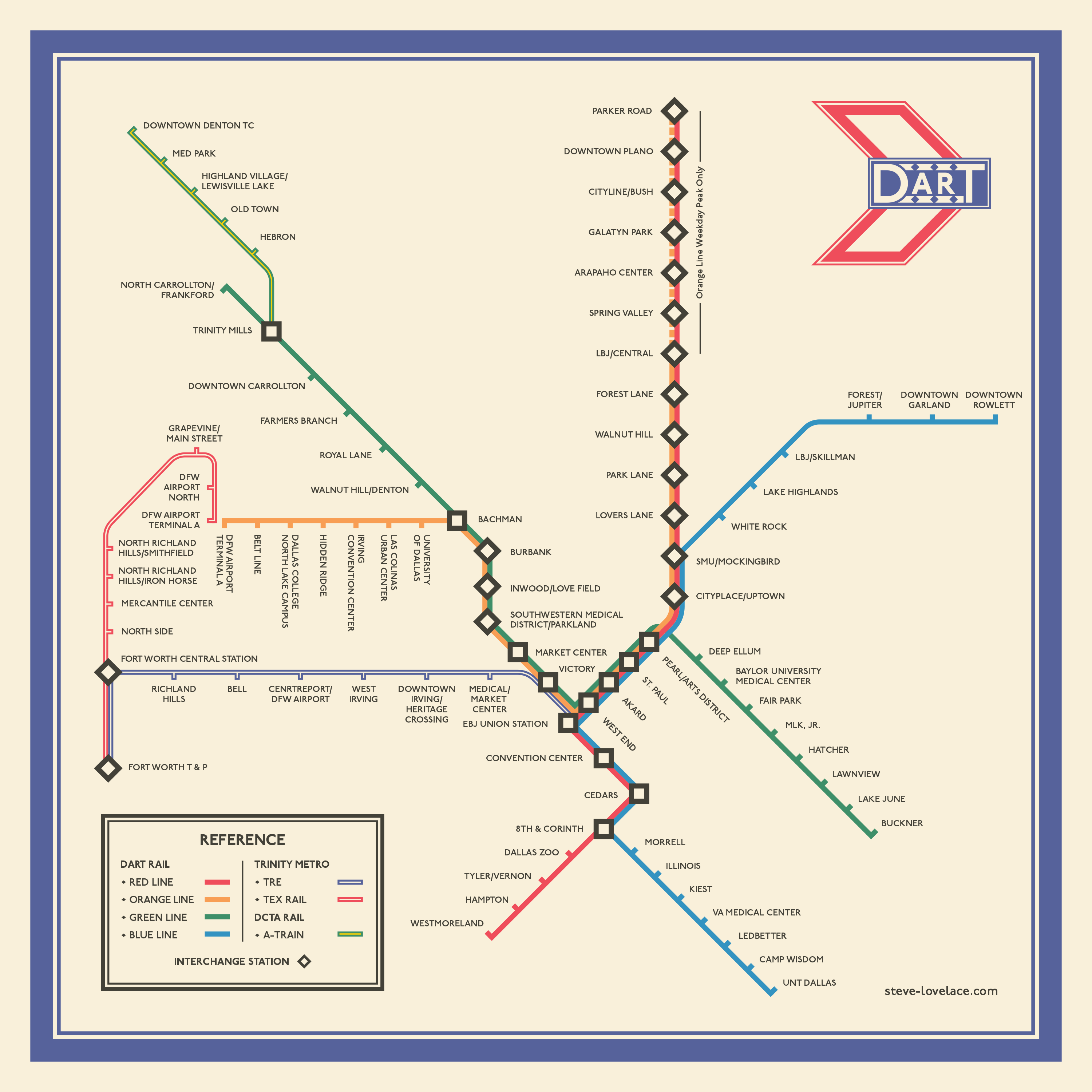
As London has continued to grow, the tube map has become more and more complicated. One of my favorite YouTubers, Geoff Marshall, has pointed out that it really ought to be called the TfL Map, after Transport for London, the government agency that runs the Tube nowadays. In addition to the proper Underground lines, TfL operates the Overground, a series of old rail corridors that have been upgraded to fill a middle ground between Tube lines and more long-distance lines. Then there are trams in the south, light rail in the east, commuter lines across the urban core, and even an aerial tram that’s mostly just a tourist trap. All of these add complexity to the map, and yet they still don’t give us the full picture of all of the rail lines criss-crossing London. Despite Harry Beck’s simplifications, the London Tube Map is more complex than ever.
Influence
Harry Beck’s Tube Map design has influenced pretty much every transit map since. Some, like the Moscow Metro, are very abstract. Others, like the current New York City Subway Map, more closely resemble a geographic map, though even the New York map takes liberties with the real world topography, such as making Manhattan much wider than it really is. In making a map based on an electrical schematic, Harry Beck redefined what a map could be. The London Underground map is really an example of “form follows function”, but the form it takes is still aesthetically pleasing. And that is why the Tube Map is my favorite.
What do you think of the London Tube Map? Are there other transit maps that you really like? Let me know your thoughts in the comment section.


2 Responses
[…] to represent versus what to leave out. My favorite map of all time, the London Underground’s “Tube Map”, is a simplified diagram that bears little resemblance to the real world geography of London. And […]
[…] sunburst design is based on the London Underground […]