Why I Love the London Tube Map
I love maps, as my many posts on this site make clear. It’s hard to pick a favorite, since there are so many maps in this world with so many designs and purposes. Still,...
I love maps, as my many posts on this site make clear. It’s hard to pick a favorite, since there are so many maps in this world with so many designs and purposes. Still,...
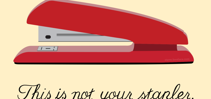
One of my favorite paintings is “The Treachery of Images” (“La Trahison des Images“) by René Magritte. Even if you don’t know the title or the artist, you may have seen it. It’s an...
Every Saturday morning, I go down to the coffee shop to do some writing. It’s one of my favorite things to do. Now I’ve always loved going to the coffee shop, and I’ve always...
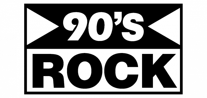
They were playing 1980s “hair metal” at the coffee shop recently: bands like Guns ‘n Roses and Mötley Crüe. Then all of a sudden, I heard the opening riffs of Nirvana’s “About a Girl”....
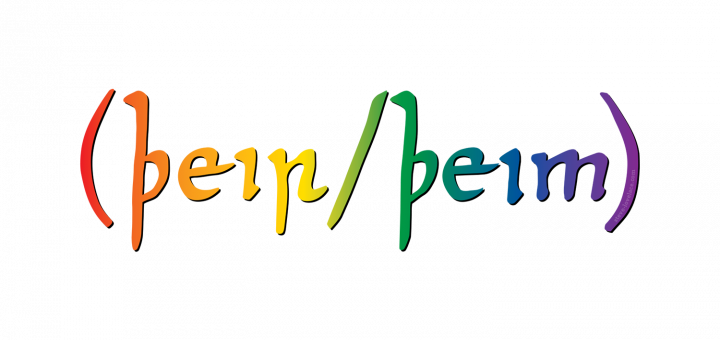
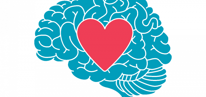
Pronouns have really come into the spotlight in recent years. It’s now fairly common for people to put “he/him”, “she/her”, or “they/them” in their social media profiles and email signatures. This is a way...
Video chat has been a concept for years. I grew up watching the Jetsons and Star Trek. I remember reading about video phones in 1990s magazines, and my phone has had the capability for...
I minored in political science, mostly by accident. I took a few poli-sci classes, and by the time I realized it wasn’t for me, I had enough credits to get a specialization on my...
It’s been two years since I wrote a blog post. I can’t believe it. I also missed the 10th anniversary of my blog in August, though as I wrote many years ago, I don’t...
My least favorite class was always gym class. I never liked penmanship much either, but gym was far worse. Especially for a nerdy kid like me, gym was an hour a day of the...
School seems so dumb sometimes, even for kids who like school. I took my schooling pretty seriously, to the point where I thought that everything else was a bunch of BS. Unfortunately for me,...
Language is the truest form of democracy. No one can completely control it. One of the things (and there are many) that makes “Nineteen Eighty-Four” so scary is the invention of Newspeak, eliminating words...