Odd Punctuation Marks
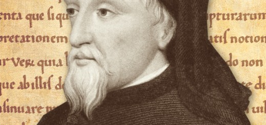
 Punctuation marks are a fairly modern phenomenon. From antiquity up through the Middle Ages, words were written together in great long strings, with little spacing or punctuation. These kind of texts were meant to be read aloud, so much so that St. Ambrose of Milan was noted for his ability to read with his mouth closed. A millennium later, the invention of the printing press led to an explosion in silent reading. This was made possible by punctuation, periods and commas and quotation marks that allow readers to gather the proper cadence and intonation of a text, without sounding out the words aloud. But as with the letters of the alphabet, not every punctuation mark made the cut. Here now are some odd punctuation marks, symbols you won’t find on your standard keyboard.
Interpunct
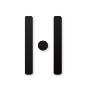 Putting a space between words seems like a no-brainer, but it’s actually a relatively new idea. Back in antiquity, they either mushed all of their words together, or used a symbol called an interpunct (·). Looking like a raised period, the interpunct is still occasionally used as a multiplication sign. You can also find it in the Catalan language, where it’s used to distinguish a double L (as in goril·la) from an LL (as in tortilla). In British English, it can be used a decimal point, though the American custom of using a period has made this form obsolete.
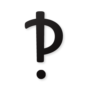
Pilcrow
 You’ve probably seen this mark before, even if you’re not familiar with its name. Looking like a filled-in backward P, the pilcrow (¶) is used to mark new paragraphs. Despite looking like a P, it is actually derived from the letter C, as it was originally used to mark a new chapter (in Latin, capitulum.)
Index
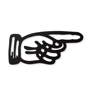 The index mark (☞) looks like a hand pointing its index finger (hence the name). Used to point out important passages in a text, the index sign blurred the line between pictogram and punctuation. It was used extensively in the moveable type era, but as a very detailed and very “wide” symbol, it didn’t work well in the age of the invention of typewriters and text-mode computers made it difficult to duplicate. Whether it will reemerge as an emoji/emoticon remains to be seen.
Asterism
 If three periods make an ellipsis, three asterisks make an asterism (⁂). Asterisms are used to indicate a break between passages of text. This is another symbol that was killed off in the age of typewriters, though you sometimes see it in books rendered as three spaced out asterisk symbols ( * * * ).
Fleuron
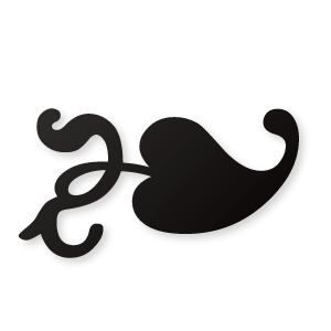 Resembling an ivy leaf, the fleuron (❧) is used to denote a new paragraph. But unlike the pilcrow, it’s meant to be decorative. Fleurons are often used nowadays for bullet points or decorative borders. As a graphic designer and typography geek, I must say that the fleuron is one of my favorite glyphs.
Interrobang
 There are many antiquated punctuation marks that have fallen out of use, but there are also upstarts. These proposed punctuation marks have yet to catch on. Of all the proposals out there, the interrobang (‽) is the most famous. It’s a cross between a question mark and an exclamation point, used to denote shock or bemusement. I’m a big fan of the interrobang, and I set up my phone to change “?!” into “‽”.
Hervé Bazin’s Odd Punctuation Marks

In 1966, French writer Hervé Bazin proposed six new punctuation marks:
- The love point looks like two questions combined to make a heart shape. Its meaning is pretty obvious.
- The certitude point, resembling an exclamation point with a line through it, represents certainty and conviction.
- The authority point looks like an exclamation point with a curved line at the top. It shows that you’re speaking as an expert of a person of authority. Hervé Bazin compared it to an umbrella carried over a sultan in the desert. At first I though this was too similar to the certitude point, but it’s actually a very clever take on the Peter Principle. Imagine Dilbert, speaking with the certitude of an engineer, being babbled at by his know-nothing boss. Hervé Bazin was wise to distinguish the two.
- The irony point shows irony or sarcasm, though pointing out irony seems a bit ironic. Another French writer, Alcanter de Brahm, proposed a small, backwards question mark at the beginning of the sentence. Hervé Bazin proposed an ending point based on the Greek letter Psi, since ironic or frivolous statements could be dismissed with a “Psssst” sound.
- The acclamation point, looking like two superimposed exclamation points, represents goodwill or welcome. Hervé Bazin likened it to the two flags on the front of a presidential limousine, rolling into town with pomp and circumstance.
- Finally, the doubt point ends a statement with uncertainty. It looks like a zigzag question mark. Hervé Bazin didn’t say why, but it looks nice.
There are plenty of other odd punctuation marks out there, both new and old, but these are my favorites. Do you know of any odd symbols or punctuation marks I should have included? If so, please let me know in the comment section.

The Authority Point looks like the Tesla Logo. Not sure how I feel about that…
Wow, you’re right! I think I published this before I had even heard of Tesla.
hey steve, u r a kindred soul. i love fonts! i’m looking to download bazin’s unique punct marks and anything else i can get a hold of…where can i get them? i remember seein an ellipses with a small dot, larger dot then real large – that kind of stuff. u must like words i would’st think. have u seen the phrontistery site on line? it will knock your zenziczenziczenic socks off! (i think i spelled it right – 8th power of a number) but go see lotta fun
Bazin’s punctuation needs to be used more.