Famous Logos in Helvetica
A while back, I took a series of famous logos and rendered them in the fonts Papyrus and Algerian. Why? Because along with Comic Sans, Papyrus and Algerian really irk graphic designers. All three of those fonts have gimmicks that make them stand out. Papyrus looks like ancient Egyptian Demotic writing, Algerian looks like an embroidered sampler, and Comic Sans looks like, well, comic book writing. Contrast these to the designers’ darling, Helvetica. Designed to be simple and unobtrusive, it is the epitome of Swiss minimalism. But Helvetica has become a victim of its own popularity. Graphic designers use it so much that it’s as played out as Comic Sans or Papyrus. And since it’s so overused, I decided to see what famous logos would look like redone in Helvetica. Here is what I came up with.
Baskin-Robbins
Burger King
Denny’s
Holiday Inn
Hooters
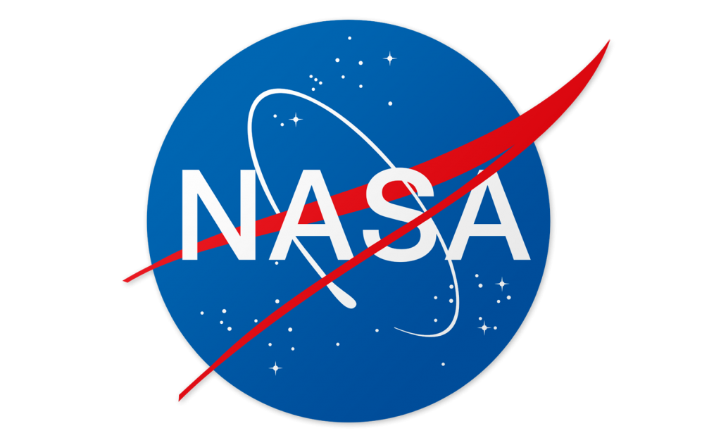
NASA
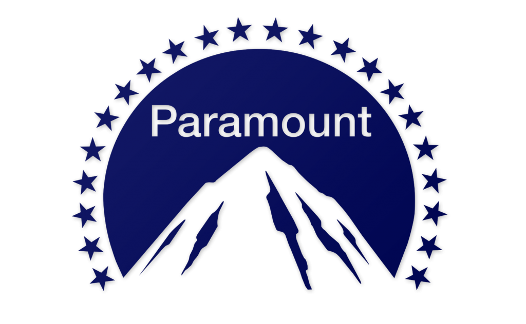
Paramount Pictures
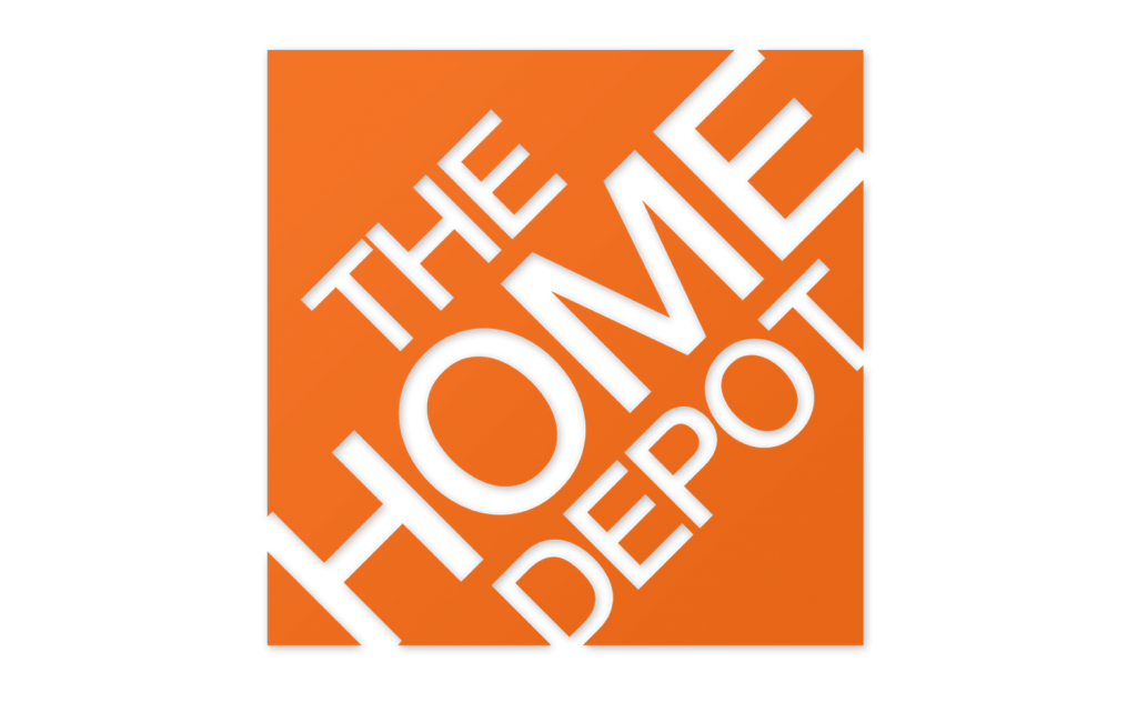
The Home Depot
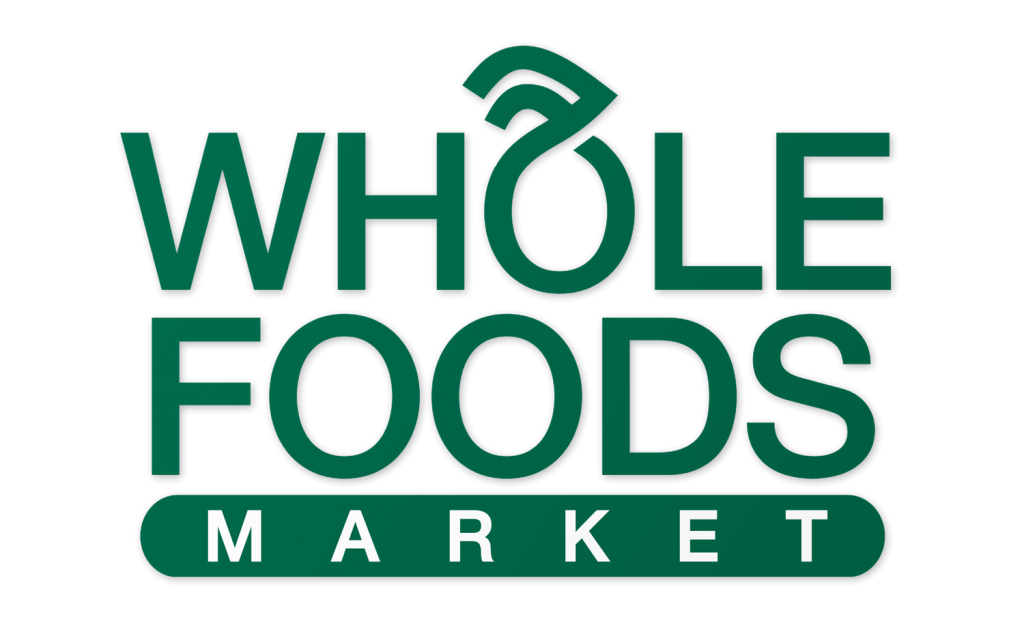
Whole Foods
Yahoo!
Unlike the logos I redid in Papyrus and Algerian fonts, the logos above don’t look all that different from their real-life counterparts. Most of them, anyway. Baskin-Robbins, Denny’s and NASA don’t look unusual at all. Whole Foods, Home Depot look better, at least in my opinion. Burger King, Hooters and Paramount Pictures look just a little bit off. The revised Holiday Inn logo seems alright, but loses much of its resemblance to the real-life logo. And then there’s Yahoo. (Or “Yahoo!” As with Yum! Brands, they use an exclamation point in their name, which I will hereafter leave out.) The Yahoo logo is a mess in Helvetica. Don’t get me wrong, it’s a mess in real life, too. With its wacky, uneven lettering, it looks like something slapped together on an old Packard Bell computer. And since Yahoo’s logo is unchanged since the 1990s, that’s probably not far from the truth. Let’s face it, the Yahoo logo would look awful in any font.
As a graphic designer who’s never been a big fan of Helvetica, I gained some appreciation for the font while doing this project. For the most part, it is a very well designed typeface that looks good in many different contexts. The same cannot be said for Comic Sans, Papyrus or Algerian. And while I would like designers use a larger array of fonts, I understand why so many artists choose Helvetica.
Next up: Jokerman


What is the actual name of the new Holiday Inn font? do you know. It’s actually quite a nice font. Just curious… Been trying to find it. Thanks
The font in the Holiday Inn logo appears to be a custom typeface designed solely for that purpose. I have not been able to find a downloadable version.
May I use the Helvetica Baskin Robbins as my profile picture?
JapanYoshi,
Sure you can use the Helvetica Baskin Robbins for your profile pic. Thank you for asking. If you ever need anything else, just ask. Thanks.
The Nasa one looks better I think.
sure, may I use Helvetica the home depot for picture.
the paramount pictures logo I think.
awesome
the denny’s logo i think.
the denny’s one looks better I think so.
nice
the whole foods market I think.
the logos look better I think.
I see tumblr
cool beans.
denny’s, and the home depot.
baskin robbins
burger king
denny’s
holiday inn
hotters
paramount pictures
home depot
whole foods
yahoo.
I like nasa
The Burger King logo
What is Helvetica Burger King on my picture.
Helvetica Battle for Dream Island!!!!!
Helvetica McDonald’s logo