The Infamous Comic Sans
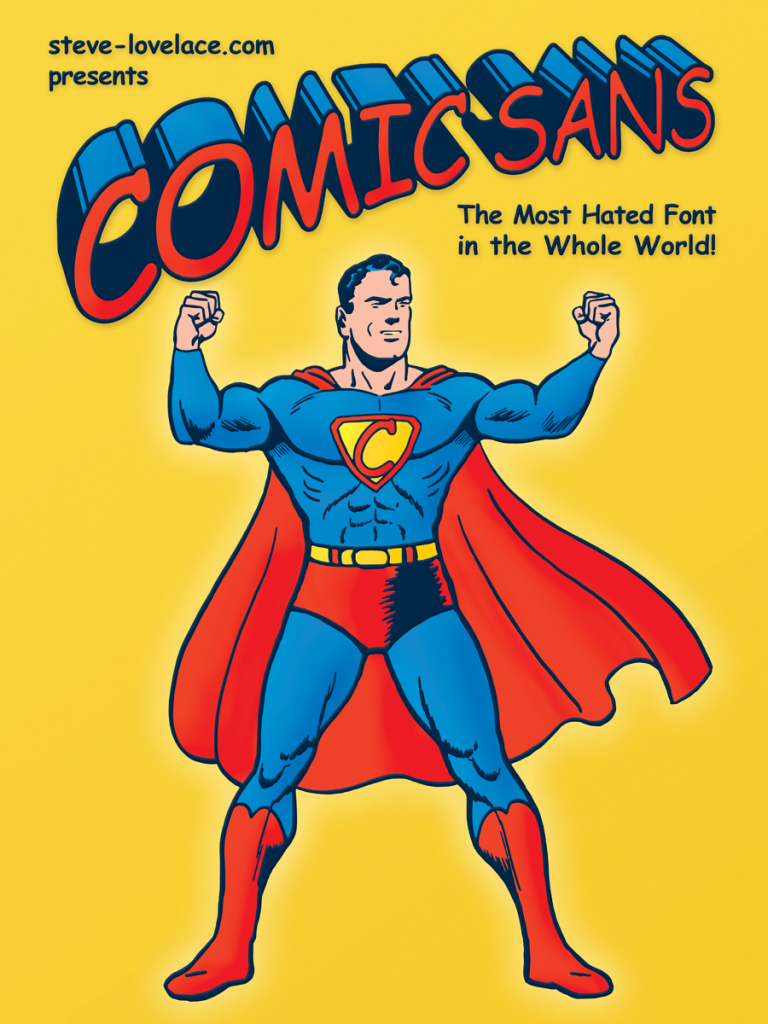
Comics Sans is the world’s most infamous fonts. Among graphic design geeks, the mere words “Comic Sans” are enough to bring out a sneer of disgust. It’s not the prettiest font, but there are far worse lurking on the bowels of the Internet. No, this is not a design problem; it’s a usage problem. Comic Sans sucks because it gets used in the wrong settings for the wrong reasons. The real question is why it’s so commonplace. Let’s take a look.
Dubious Origins
First off, let’s take a look why Comic Sans is so common. That’s an easy question to answer. It’s been included on every PC since Windows 95. But how did it end up as a standard Windows font in the first place. It all goes back to one of Microsoft’s biggest flops: Microsoft Bob. This program featured an interface in which a selection of cartoon characters would guide novice computer users through a series of virtual rooms. Microsoft developed Comic Sans for the characters’ speech balloons (though it didn’t make the deadline for the final product). In this regard, Comic Sans was designed with the best of intentions. It was made to look like the hand-lettering in comic strips and comic books. The problem is, it fails in this regard.
Technical Difficulties
Comic Sans is supposed to look like handwriting, but it doesn’t. The problem is that every letter looks the same. Every letter “A” looks like every other. Comic Sans was designed back in the days of ASCII, when a font consisted of the basic alphabet and numbers (and maybe a few basic “foreign” characters.) Nowadays we have OpenType Unicode fonts with thousands of characters. So now you can have several subtle versions of each letter, so that the font looks less mechanical. Unfortunately, OpenType is clunky, requiring manual tweaks to work at full effect. And when it comes to Comic Sans, graphic designers aren’t the problem.
A Folksy Simulacrum
And thus we come back to the same question. Why do people use Comic Sans? People use it because its the closest thing most computers can get to handwritten text. It’s one of the few respites we have from the cold impersonal look of the Information Age. The most common uses of the font: email signatures and office signs, are both places where people want to add a little human warmth. That’s why people like Comic Sans. Never mind that it’s not very good. People use it because it’s there.
The Future of Comic Sans
In the next few years, Comic Sans and other handwriting fonts will get better. New font technologies will allow us to make fonts that look like they were truly written by hand, breaking Comic Sans’ monopoly. But even that’s only a temporary step. For a generation of kids growing up with technology, handwriting fonts won’t feel warm and familiar. They’ll feel archaic, like blackletter does to us. Though that makes me wonder if Comic Sans will one day be used for elegant occasions, bringing back nostalgia for the Golden Age of Typography. Perhaps Comic Sans will outlive us all.


9 Responses
[…] During the development of Microsoft Bob, graphic designer Vincent Connare noticed that the cartoon characters’ speech balloons were written in Times New Roman. There were few fonts available on Windows back then, and none of the existing typefaces were appropriate for speech balloons. So Connare made a new font that resembled the hand lettering used in comic books and comic strips. Unfortunately, his Comic Sans font didn’t make the deadline for Microsoft Bob 1.0. However, it was added to Windows in anticipation of future versions of Microsoft Bob. And while there was never a Bob 2.0, Comic Sans remained. Soon it was taking up by office workers looking for a computerized equivalent of handwriting, and within a few years, it became the most hated font in the world. […]
[…] I discovered a Tumblr that features famous logos done in the font Comic Sans. Comic Sans is infamous in the design community as one of the ugliest fonts around. It’s not just that Comic Sans is ugly, it’s also […]
[…] better than the Papyrus logos I made last week, and Algerian is still leaps and bounds better than Comic Sans. But that doesn’t mean that Algerian isn’t overused. It is. And because of its […]
[…] series of famous logos and rendered them in the fonts Papyrus and Algerian. Why? Because along with Comic Sans, Papyrus and Algerian really irk graphic designers. All three of those fonts have gimmicks that […]
[…] Comic Sans is the most reviled font in the world. There are worse fonts, for sure, but Comic Sans has become the most infamous. Today it’s become the “Plan 9 from Outer Space” for typography geeks. Like a bad movie, it’s now enjoyed ironically. Professional graphic designers spend time redesigning things like logos and movie posters in The World’s Worst Font. I’m a sucker for such redesigns, so I thought I’d make my own. Here are some famous book covers in Comic Sans. […]
[…] on Texas logos this time, drawing some of the Lone Star State’s most famous brands in the world’s most infamous font. Here are my top ten Texas logos in Comic […]
[…] It’s one of the most overused fonts out there, and while it’s not quite as hated as Comic Sans, it’s arguably worse. Comic Sans, is for the most part, a very readable font. On the other […]
[…] is a display typeface. Unlike Helvetica, or even Comic Sans, it’s not meant for large chunks of text. It’s meant for short, whimsical applications, […]
[…] did not actually use Comic Sans. That’s just my own degenerate […]