Famous Logos in Papyrus Font

Recently I discovered a Tumblr that features famous logos done in the font Comic Sans. Comic Sans is infamous in the design community as one of the ugliest fonts around. It’s not just that Comic Sans is ugly, it’s also overused. But it’s not the only one. The Papyrus font is another overused typeface. Mostly it’s used for restaurant menus, but you sometimes see it in more professional contexts. James Cameron even used it in his epic sci-fi film, “Avatar”. In any case, it got me to thinking, what would other famous logos look like in Papyrus? Let’s take a look.

Amazon

Amazon Logo in Papyrus Font

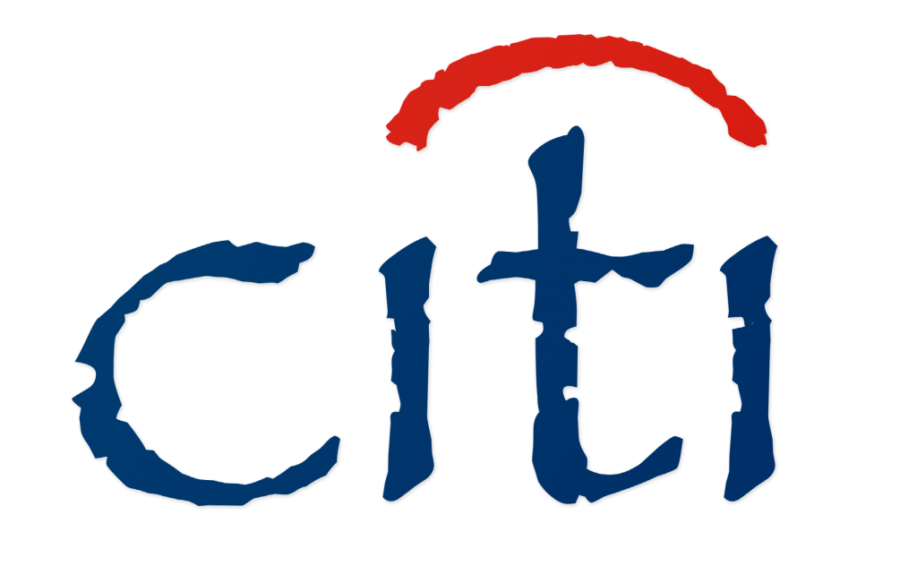
Citi

Citi Logo in Papyrus Font

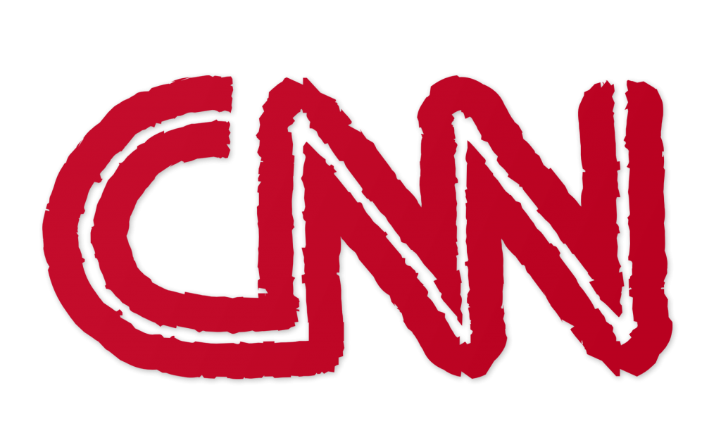
CNN

CNN Logo in Papyrus Font

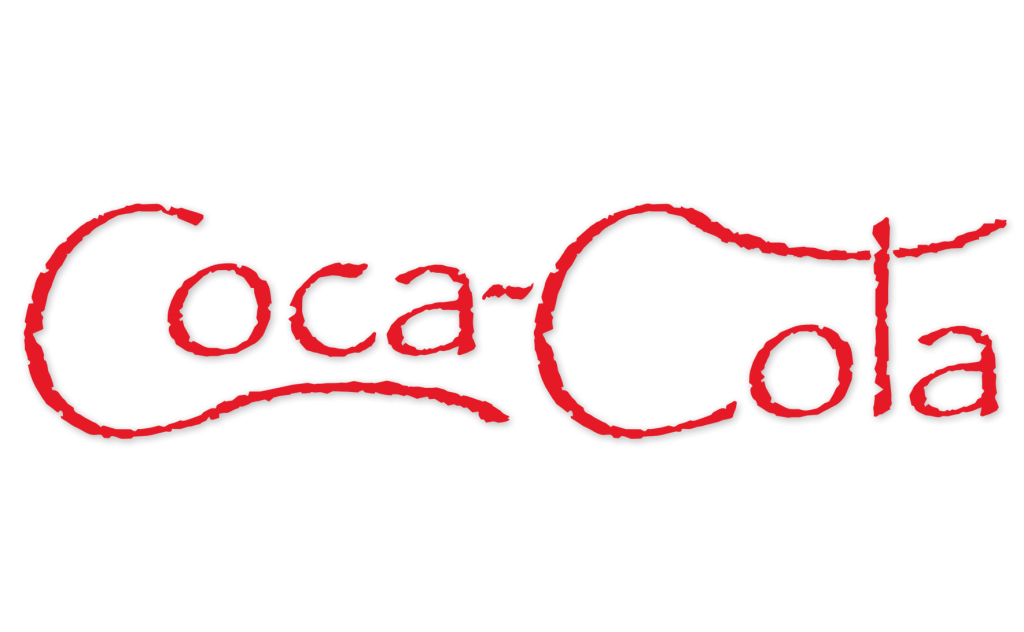
Coca-Cola

Coca-Cola Logo in Papyrus Font

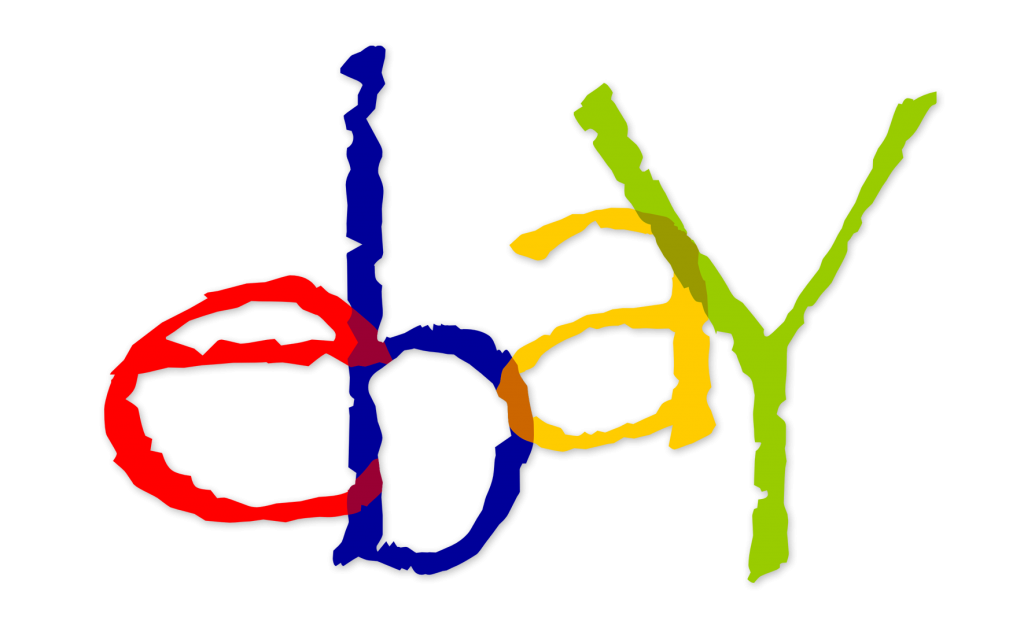
eBay

eBay Logo in Papyrus Font

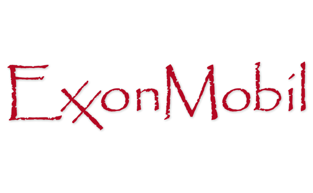
ExxonMobil

ExxonMobil Logo in Papyrus Font

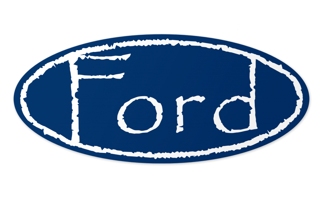
Ford

Ford Logo in Papyrus Font

Google

Google Logo in Papyrus Font

IBM

IBM Logo in Papyrus Font

Walmart

Walmart Logo in Papyrus Font

Some of the logos look fine in Papyrus font. Logos that use simple sans-serif fonts, like Amazon and Walmart, look okay. Logos with elaborate script fonts, like Ford and Coca-Cola, are virtually unrecognizable. The CNN logo looks pretty good, though after connecting the letters and adding the white stripe, it no longer looks like Papyrus. That brings us to the heart of the question. Why is Papyrus such a bad font for logos? It has to do with the proportions.

Papyrus isn’t inherently bad. It’s just badly proportioned. Look at the size of the capital letters compared to the size of the lowercase letters. In many places, it just doesn’t work. And while a competent graphic designer can tweak the proportions, the result may bear little resemblance to the original Papyrus font. That’s because a good wordmark logo shouldn’t use a stock font. It should be tweaked, so that it becomes a unique work of art in and of itself.

Next week: logos in Algerian font.

Steve Lovelace

Steve Lovelace is a writer and graphic artist. After graduating Michigan State University in 2004, he taught Spanish in Samoa before moving to Dallas, Texas. He blogs regularly at http://steve-lovelace.com.

You may also like...

28 Responses

  1. I think one of the reasons why it’s such a despised font is that it’s designed to look reminiscent of ancient Egyptian lettering, but it’s used for situations that aren’t trying to communicate ancient, Egyptian, or hand-crafted.

  2. eb says:

    I cringe every time I see Edible Arrangements – papyrus should be restricted to the under 12 demographic only. There is no instance where it tells the audience you are a professional with it.

  3. Oliver says:

    I was thinking very hard about using Papyrus for a new logo but got put off with some current uses and the fact that as a will writing professional it was just missing something. I thought it would convey a hand written approach but look professional as well, but I feel it was just too much off the beaten track for what I wanted. For this reason I went for Trajan Pro which is more professional but also better proportioned.

  4. rileytog says:

    the ford is much better.

  5. rileytog says:

    ford and coca cola

  6. Josh Kraft says:

    Nice, Walmart is awesome

  7. Mike Perdue says:

    +Josh Kraft Sometimes I had a Walmart one, lol

  8. Kanwaljeet Singh says:

    Some People Use this Coca Cola logo in Mandela effect (~) Coca~cola . They say (~) symbol never ever seen.

  9. Aidan R says:

    I Like walmart

  10. Joseph says:

    The Citi and Ebay logos actually work. But ya Papyrus is a logo that was part of it’s time. Like Photoshop effects back in the day, when they were first introduced people loved them, but trends change and Papyrus didn’t age well.

  1. December 10, 2012

    […] in Comic Sans, I decided to create some of my own logos done in hated fonts. Last week, I featured logos in Papyrus font; an ill-proportioned font popular with restaurants. This week, I’m redoing logos in the […]

  2. February 4, 2013

    […] while back, I took a series of famous logos and rendered them in the fonts Papyrus and Algerian. Why? Because along with Comic Sans, Papyrus and Algerian really irk graphic […]

  3. February 20, 2013

    […] change the feel of a logo. I illustrated this a few months ago by using two widely-despised fonts, Papyrus and Algerian, in a variety of famous logos. The results were pretty hideous. As one commenter on […]

  4. April 19, 2013

    […] phones, typing capital letters is even harder than before. Perhaps one day caps will be limited to period fonts and antique signage. Until then, lets make it a little harder to type in all […]

  5. April 20, 2013

    […] always found it fascinating. Heraldry has a great deal if influence of modern corporate branding. Corporate logos are just the 21st Century equivalent of medieval shields. This shows up on subtle ways, such as the […]

  6. July 22, 2013

    […] you like these logos, check out my famous logos in ugly fonts such as Papyrus, Algerian and Jokerman. And if you have any good ideas for more cat logos, let me known in the […]

  7. September 2, 2013

    […] logos and how they’d look if they were made with some of these fonts: Comic Sans – Papyrus – Jokerman […]

  8. October 4, 2013

    […] Zapf, Optima crosses the line between a serif and sans-serif font. So after redoing famous logos in Papyrus and Algerian, I thought I’d try redoing some famous websites’ logos in […]

  9. November 15, 2013

    […] (and I hope you are), you already know of my love of redoing famous logos in ugly fonts like Papyrus, Algerian and Jokerman. For me, there’s something rewarding about distilling a logo or […]

  10. February 12, 2014

    […] is an unusual font. Unlike Helvetica, Papyrus or even Jokerman, it’s not a font that uses letters. Instead it’s what’s called a […]

  11. May 3, 2014

    […] have a love-hate relationship with the font Papyrus. Mostly hate. It’s one of the most overused fonts out there, and while it’s not quite […]

  12. September 18, 2014

    […] Compiled logos from Steve Lovelace […]

  13. August 2, 2016

    […] good in Chicago. They certainly look better than my renditions of famous logos in ugly fonts like Papyrus and Jokerman. The fact that Chicago holds up after all these years is a testament to the genius of […]

  14. February 13, 2017

    […] Sans is the world’s most infamous fonts. Among graphic design geeks, the mere words “Comic Sans” are enough to bring out a […]

  15. March 13, 2017

    […] the world and recreates them using a different typeface. The results – which you can view here, here, here, here, here and here – are boring at best and hideous at worst: Pinterest loses its pizazz […]

  16. June 7, 2022

    […] Let’s take a look again at some major brands if they used Papyrus font. Steve Lovelace put together a compilation of examples: […]

Leave a Reply

Your email address will not be published. Required fields are marked *

This site uses Akismet to reduce spam. Learn how your comment data is processed.