The Rule of Tincture in Modern Design
 Heraldry is the art and study of coats of arms, seals and banners. It’s the medieval equivalent of graphic design, and as someone interested in both history and design, I’ve always found it fascinating. Heraldry has a great deal if influence of modern corporate branding. Corporate logos are just the 21st Century equivalent of medieval shields. This shows up on subtle ways, such as the rule of tincture.
Modern Applications
Back in 2009, the State of Texas introduced a new license plate. It was a colorful design, red on the left fading into a blue right and a white bottom, all beneath black block letters. It might have worked as a painting, but as a license plate, it was a mess. The plates were hard to read, and crime victims were unable to tell police their attackers’ license plate numbers. In 2012, the state debuted a new design: a simple black-on-white design that scrapped the complex
Heraldry has its roots in the very practical matter of making shields for the battlefield. With all of the combatants suited up in armor, it was important to be able to tell friend from foe. Readability was a matter of life and death. So medieval heralds divided the color palette into two major categories: colors and “metals”. Each color and metal was given a funny name from Norman French, the language of the medieval élite:
Funny Names for Basic Colors
The words “argent” and “or” mean “silver” and “gold”, respectively. On a shield, these should be wrought in actual metal. Whereas on paper or computer screen, they are rendered white and yellow. The other colors were painted on the shields and should not be rendered in metallic.
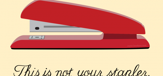
Despite the funny names of heraldic blazon, the rule of tincture is quite simple: dark colors shouldn’t go on dark colors and light colors shouldn’t go on light colors. That’s it. If you want a shield, flag, sign or logo to be readable, make sure to give it some contrast.
Have you ever heard of the Rule of Tincture? Can you think of examples that violate this rule but still work well? Let me know your thoughts in the comment section.


3 Responses
[…] of them contain elaborate vignettes. European coats of arms, many of which were used in battle, have much simpler designs. But aesthetics aside, the Minnesota seal represents Manifest Destiny. By showing a Native American […]
[…] couple weeks ago I talked about the Rule of Tincture, a medieval heraldic convention that says that you shouldn’t put dark colors on a dark […]
[…] like color, and I use it a lot in my line of work. Most of my art and design work is very colorful, and in my […]