Zero Shades of Gray: Black and White Design

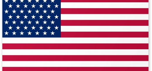
The Union Jack is still recognizable without any color.
They say it’s not good to think in terms of black and white. This is certainly true if you’re a lawyer or a politician, but as an artist, black and white design can be very helpful. The big difference between design and art is communication. When it comes to art, communication comes second to aesthetics, and often the message is ambiguous. Aesthetics is important in design as well, but the message has to come first. By reducing the design down to black and white, eliminating all the shades of gray, we can boil the design down to its most basic meaning.
A Tale of Two Flags

The grayscale flag is a muddy mess, while the black and white flag is easily recognizable.
The flag of Great Britain is one of the most iconic designs ever made. Why? Because the Union Jack looks equally good in color or black or white. This is due to fimbriation, the technical term for the narrow strips of white between the blue and the red.
The Michigan flag, on the other hand, contains many different colors and shades. With all these colors, there is not nearly enough contrast for the design to be seen from afar. When reduced to grayscale, the “Circumspice” motto scroll jumps out more than the coat of arms itself. This is a design failure. On the other hand, the emblem is much more balanced if we reduce it down to black and white, with no shades of gray. It’s still a bit cluttered for my tastes, and it still looks too much like other state flags, but adding a little bit of contrast makes a big improvement.
The Rule of Tincture Refined
A couple weeks ago I talked about the Rule of Tincture. This medieval heraldic convention that says that you shouldn’t put dark colors on a dark background, or light colors on a light background. The concept of black and white design is a further refinement of this ancient rule. Whereas the Rule of Tincture boils the color palette down to five dark “colors” and two light “metals”, the rule of black and white design simplifies things even further: black and white. These are the only two colors you need for effective communication.
Color has its place, mind you. Subway maps would be a lot harder to read. Flags would be useless and boring. Traffic lights would be a lot more dangerous, especially at night. But even though color has its uses, black and white is still a good place to start. A black and white design almost always looks good in color, but a color design only occasionally looks good in black and white.


5 Responses
[…] but the blue and red on the canton clashed with the green field of the flag. Remembering that the best designs are monochromatic, I simplified the Union Jack to a simple white design. The result is the flag featured at the top […]
[…] we fought over which car we wanted to be. We both wanted to use the car token that was painted black, not the one that was in its natural pewter. My favorite memories of Monopoly come from New Years […]
[…] Despite the funny names of heraldic blazon, the rule of tincture is quite simple: dark colors shouldn’t go on dark colors and light colors shouldn’t go on light colors. That’s it. If you want a shield, flag, sign or logo to be readable, make sure to give it some contrast. […]
[…] image of Big Brother from Apple’s iconic “1984” commercial, and turned it red and black to match the color theme of the rest of the page. Then I recreated the “Ingsoc” logo […]
[…] so that one rogue application wouldn’t take down the whole computer. It used a high-resolution (grayscale) monitor that allowed for large, detailed icons. Most importantly, the NeXT OS had built in […]