The Problem with Yellow
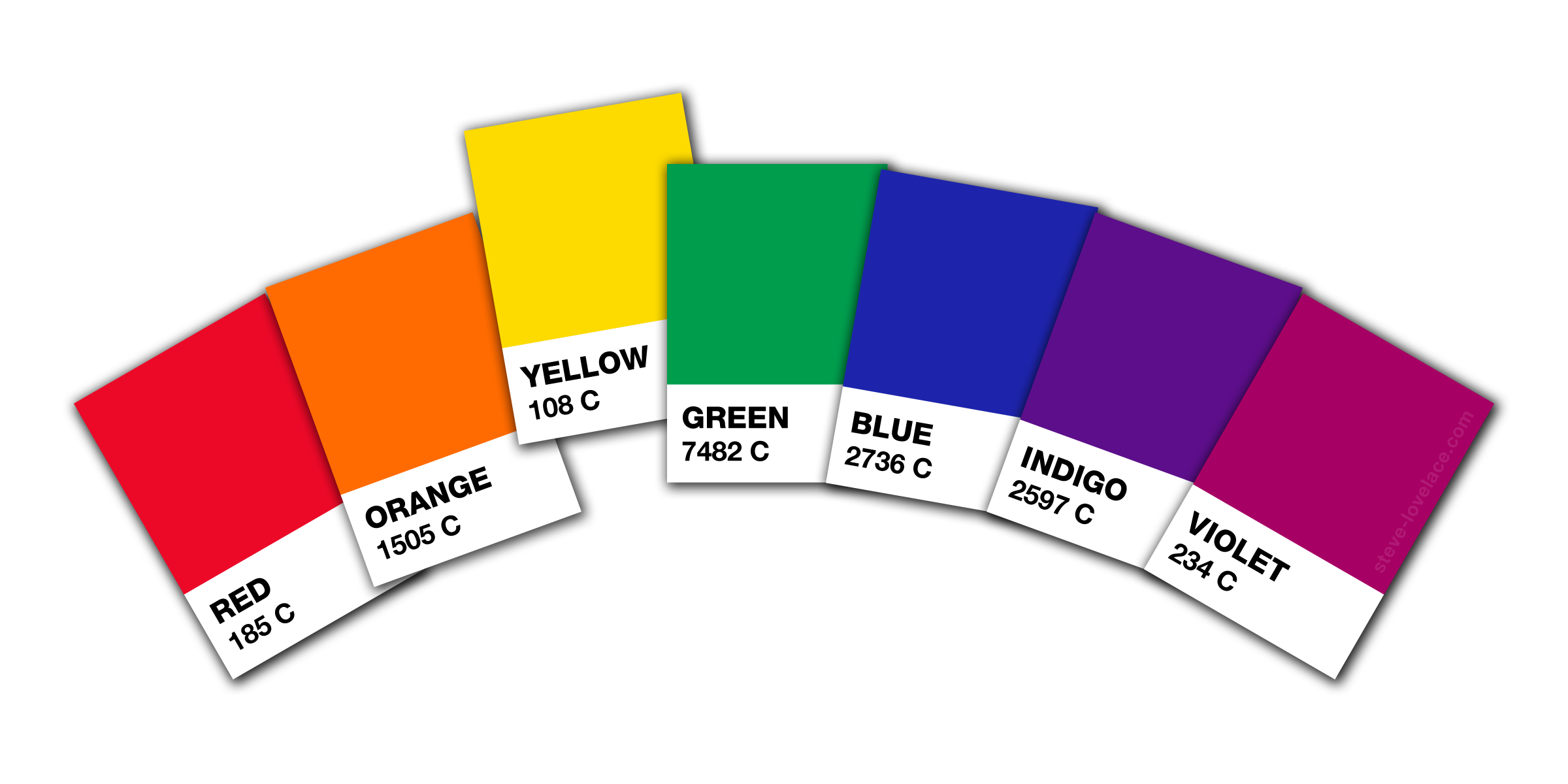
I like color, and I use it a lot in my line of work. Most of my art and design work is very colorful, and in my personal life, I wear a lot of bold colors. I especially like saturated primary and secondary colors: the old ROY G BIV. But when it comes to design, one of these colors is a real troublemaker: the color yellow.
Yellow is my least favorite of the “major” colors. Maybe it’s just a personal bias. Yellow shirts just don’t work with my pale complexion. But the color also causes me problems as a graphic designer. It’s the lack of contrast. For reasons having to do with the anatomy of the eye, it’s brighter than the other colors. You can put red or green or blue words on a white background and have them be legible. But yellow is barely visible. It’s frustrating for someone who likes to make colorful graphics.
There are two ways to deal with this color’s annoying brightness. Neither are ideal. The first is to decrease the saturation, making your color more mustardy. Go too far and you’ll end up with brown. The other solution is to change the hue, making it more orange. The first solution makes it mismatch the more saturated colors, but if you’re willing to tone down the overall saturation, it can be a good solution. But if you want to keep your colors vibrant and saturated, you’re probably going to have to make your yellow more orangish. The downside of this is that you lose a color. Instead of having yellow and orange, you only have an in-between color. Still, this can be a good solution for when you want to use a small color palette, such as red, green, blue, and yellow-orange.
Yellow is a special color. It’s not my favorite, but I can appreciate it for its uniqueness. What do you think? Let me know in the comment section.


4 Responses
[…] should be wrought in actual metal, whereas on paper or computer screen, they are rendered white and yellow. The other colors were painted on the shields and should not be rendered in […]
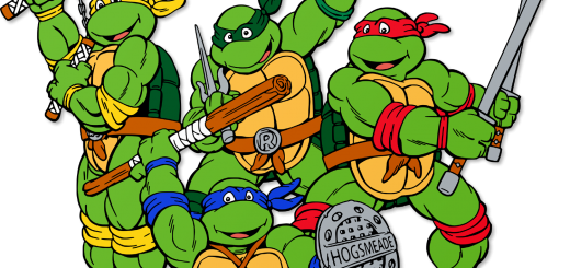
[…] Ninja Turtles clad in the colors of their respective Hogwarts Houses: Michelangelo in Hufflepuff Yellow, Raphael in Slytherin Green, Donatello in Ravenclaw Blue and Leonardo in Gryffindor […]
[…] done. It is a simple geometric design that is easy to reproduce and easy to remember. Its black and yellow colors are made to be visible in low light. It’s the type of iconic imagery that, as a […]
[…] I didn’t want it to be too obvious, so instead of a drawing of a corn cob, I used a simple yellow stripe to evoke the look of a golden field of maize. I used the same blue and yellow shown on the […]