Redesign 101: The Flag of Minnesota
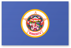
Like Michigan and Vermont, Minnesota is yet another state with a blue flag and a coat of arms. The flag of Minnesota is not just boring, however. It is garish, gaudy and borderline offensive. To see what I mean, let’s take a close look at the Minnesota coat of arms.
The Seal of Minnesota

A closeup of the Seal of Minnesota. For some reason, it reminds me of a Family Circus cartoon.
If you look at the seals and coats of arms of the US States, you’ll see that most of them contain elaborate vignettes. European coats of arms, many of which were used in battle, have much simpler designs. But aesthetics aside, the Minnesota seal represents Manifest Destiny. By showing a Native American riding off into the sunset while a white farmer tills the soil, the Seal of Minnesota is stuck in a 19th Century worldview. Even if you interpret it more innocently, it’s still too far of a complex design to put on a flag, especially since the version that’s on the flag adds a wreath of flowers, some stars, a motto, three dates and the name of the state. It’s a mess.
A New Flag of Minnesota
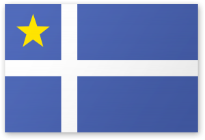
One thing I like about the current flag of Minnesota is that it has an icy shade of blue, as opposed to the darker blue used on most state flags. Since Minnesota is the Land of 10,000 lakes, it makes sense to stick with blue. The current flag also has a lot of gold stars on it, along with the motto “L’Etoile du Nord” (The North Star). So I kept one star and moved it to the top left corner. Finally, since Minnesota has a large Scandinavian population, I designed the whole flag in the style of a Nordic Cross. Based on the Flag of Denmark, this design has been in constant use since at least 1219. It’s an old design, and a striking one, and since no other state uses it, it would make the Flag of Minnesota stand apart.







2 Responses
[…] It took a few years to sort things out, but eventually the Green Mountain Republic gained admission to the union as the fourteenth state. While the Green Mountain Flag was still popular during this time, it wasn’t official. So in 1804, Vermont adopted a new flag (not pictured) that looked a lot like the US Flag. It had 17 stars and 17 stripes and the word “Vermont” along the top. A few years later, in 1837, they changed the number of stripes back to 13 and added the state seal inside of an eight-point star. This was a visual improvement, but it was still not as distinctive as the revolutionary flag. It was also easily confused with the US flag, so in 1923, the state adopted the generic coat of arms designed used by other Union states like Michigan and Minnesota. […]
[…] half of the states have plain blue flags with seals in the middle, including Michigan, Vermont and Minnesota. But even amongst these generic blue designs, there are some ugly duckings. Of all these plain and […]