Redesign 101: The Flag of Nebraska
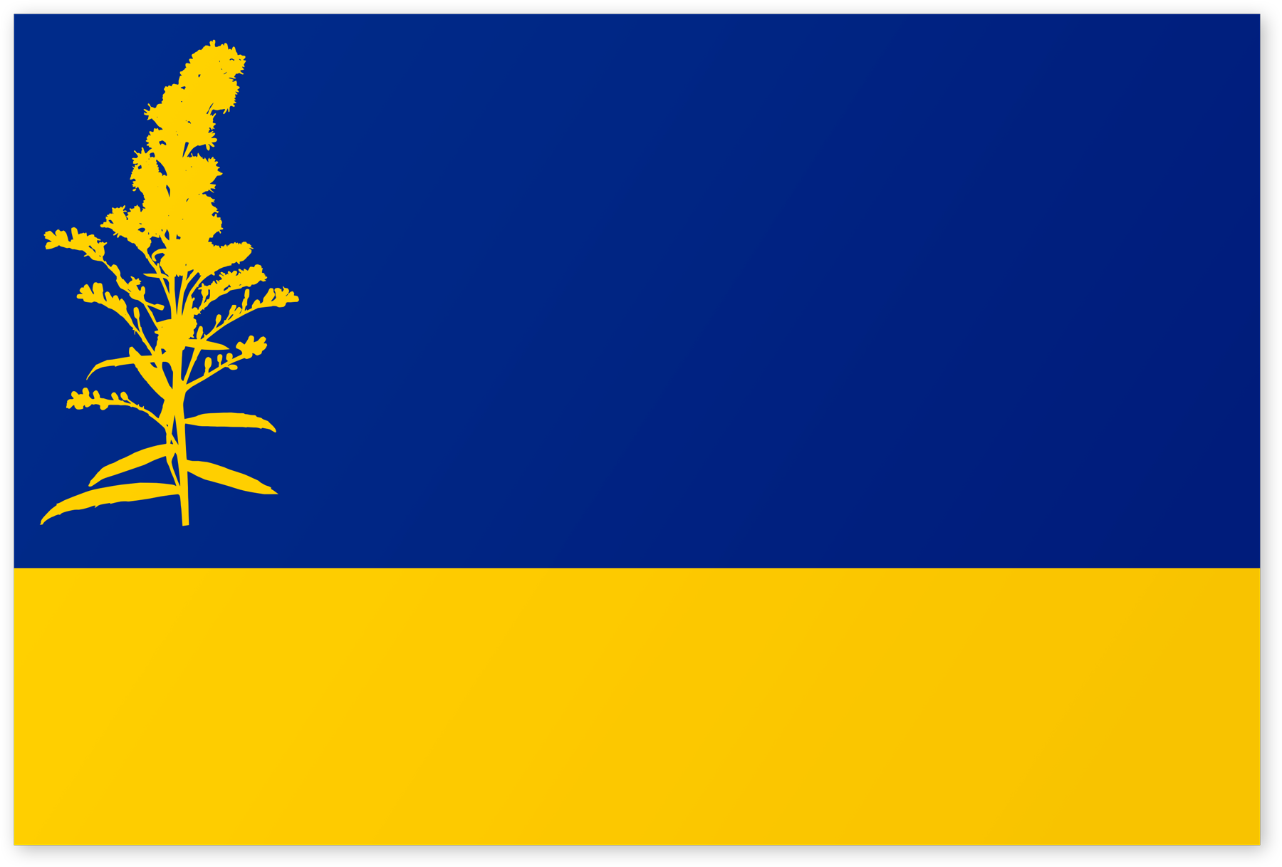
Proposed Flag of Nebraska
What’s the worst flag in America? There are some pretty bad ones out there. City flags, in particular, tend to be badly designed. But let’s stick to state flags for now. When it comes to state flags, there are plenty of bad designs. Almost half of the states have plain blue flags with seals in the middle, including Michigan, Vermont and Minnesota. But even amongst these generic blue designs, there are some ugly duckings. Of all these plain and ugly flags, the worst design award goes to the flag of Nebraska.
2001 NAVA Rankings

Current Flag of Nebraska
I’m not the only one who thinks that the flag of Nebraska is the worst in the country. Back in 2001, the flag experts at the North American Vexillogical Association (NAVA) ranked the flags of every US state, district and insular area, along with every Canadian province and territory. Of the 72 designs ranked, the worst flag award went to Georgia, which at the time, had a horrible compromise flag in the state’s effort to eliminate the Confederate battle flag. Georgia soon changed its flag to an attractive design that resembled the first, lesser known, Confederate flag. Which left us with the runner up: Nebraska. The Nebraska flag is nothing special. Indeed, it’s its forgettableness that makes it so awful. Like the other state flags I’ve redesigned, it’s really just a blue sheet with a seal on it. But even the seal is awful. It has that “designed by committee” look, where people keep adding things, afraid to step on anyone else’s toes.
A New Flag of Nebraska
For my new flag of Nebraska, I started with the thing that Nebraska is most well-known for. Corn. Fair or not, that’s what makes this state famous. And yet, I didn’t want anything too corny. (Mind the pun.) I didn’t want it to be too obvious, so instead of a drawing of a corn cob, I used a simple yellow stripe to evoke the look of a golden field of maize. I used the same blue and yellow shown on the current flag of Nebraska. Then in the same shade of yellow, I added the silhouette of a goldenrod, a common prairie flower that is the State Flower of Nebraska.
Even though this is a still a blue flag with a yellow design on it, it’s much more recognizable than the current flag of Nebraska. What do you think of my design? Do you have your own ideas for what you’d put on Nebraska’s state flag? Let me know your thoughts in the comment section.


Very well done, I completely agree with the status of the current flag.
The color scheme is similar to Ukraine. I think the corn stalk should be larger and in its natural colors (heraldic “proper”)
As somone from nebraska i very much dislike this because of its A. not being unique and just being a almost carbon copy of the Ukriane flag and 2. Its not all corn here
I’ve been looking through redesigns of state flags, and making some of my own, and of all the ones I’ve seen this is by far the most beautiful.
Thank you!
I think the silhouette is a bit complicated, but a much better flag than before. Maybe a call to how dead center we are in the mainland would work? also the Omaha city flag is really nice and a city flag clearly beating a state flag is not good news.