Redesign 101: The Flag of Vermont
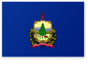
Conformity can be an ugly thing. Vermont has had several flags in its history, and over the years the Flag of Vermont had gotten plainer and uglier. The current flag, blue with a coat of arms, looks just like the flags of half the other US states. This completely ignores Vermont’s history as an independent republic and its status as the first post-Revolution state. Most of all, it ignores the good design of the past.
The Green Mountain Republic
Vermont started as a strip of disputed territory between the colonies of New York and New Hampshire. During the American Revolution, the people living in this disputed zone decided they’d rather have their own government. Led by a revolutionary named Ethan Allen, they declared their independence as the Green Mountain Republic, while allying themselves with the nascent United States. Their flag reflected their loyalties. With a green field and a blue canton, it evoked Vermonters’ loyalty to America while asserting their independence.
State Flags
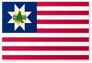
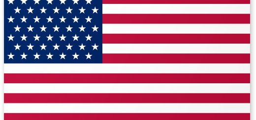
It took a few years to sort things out, but eventually the Green Mountain Republic gained admission to the union as the fourteenth state. While the Green Mountain Flag was still popular during this time, it wasn’t official. So in 1804, Vermont adopted a new flag (not pictured) that looked a lot like the US Flag. It had 17 stars and 17 stripes and the word “Vermont” along the top. A few years later, in 1837, they changed the number of stripes back to 13 and added the state seal inside of an eight-point star. This was a visual improvement, but it was still not as distinctive as the revolutionary flag. It was also easily confused with the US flag, so in 1923, the state adopted the generic coat of arms designed used by other Union states like Michigan and Minnesota.
A New Design
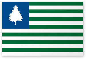
I would love to see Vermont go back to the Green Mountain Republic flag, but since this is a design blog, I’ll propose my own design as well. It’s a cross between the first and third flags of Vermont. My proposal would start with the blue canton of the Green Mountain Republic, while replacing the star field with the pine tree from the state’s coat of arms. In addition, to celebrate Vermont’s place as the first state added to the original 13, I would add 14 green stripes to the body of the flag.
Vermonters pride themselves on their uniqueness and independence. Thus they should have a flag that is as unique as their state. Going back to their original flag would be a good step on that direction. And if they’d prefer something else, they could try my design.
Next week: Minnesota







I Think it’s a good idea to have flags reflect the evolution of their states in today’s political environment.
Re: the Green Mountain Republic. What you are referring to is the Republic of Vermont (known for the first few months of its existence as the Republic of New Connecticut). There is no known flag associated with this entity, which lasted from 1777 to 1791. The flag you show is a bad interpretation of a remnant of a flag now in possession of the Bennington Museum. It is in fact a piece of a 1779 Continental Regimental flag and its green field likely had a design painted on it. The Gostelowe Return, which cataloged a number of flags in the Continental Army in 1779, mentions the “union being 13 stars”. Another Gostelowe flag that sold at auction in 2006 (3rd Virginia) has a nearly identical canton of stars. In addition, both the Bennington Museum and the New Hampshire Historical Society have small remnants of what was supposedly the same flag as the canton remnant also at the Bennington Museum. Both of these fragments have gold decorations painted on them that match another remnant of the Gostelowe flags, the Headman color now in the Smithsonian. In my opinion, it is critical that these four fragments be compared to determine if they may all be part of the same flag. I suspect they may be. BTW, the donors of the canton remnant heralded as the “Flag of the Green Mountain Boys” never made any such claim. It is an urban legend that has persisted for 150 years.