Famous Logos in Jokerman Font
You’d be amazed at the difference a font can make, especially one used in a wordmark or logo. Just using a different style of lettering can completely change the feel of a logo. I illustrated this a few months ago by using two widely-despised fonts, Papyrus and Algerian, in a variety of famous logos. The results were pretty hideous. As one commenter on this blog said, “These logos hurt to look at.” So then I went the other direction, substituting the graphic designer’s darling, Helvetica. This left me with a series of competent, but bland designs. So this week, I’d like to try it out with the Jokerman font.
Jokerman is a display typeface. Unlike Helvetica, or even Comic Sans, it’s not meant for large chunks of text. It works best for short, whimsical applications, like the logo of a day care center, or the headline of a church newsletter. It’s certainly not meant for the logos of serious, Fortune 500 corporations, so naturally, I used it for just that. Here are the results.
Boeing
Costco
Ferrari
Intel
Kroger
Lowes
Mastercard
Rite Aid
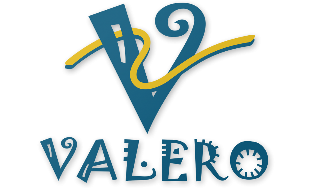
Valero
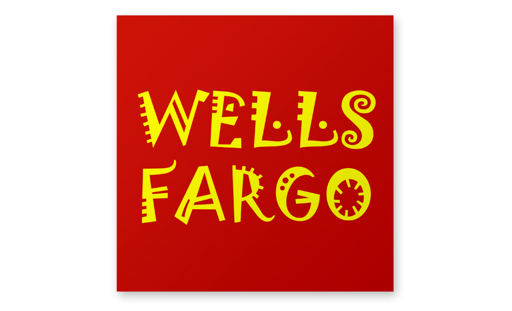
Wells Fargo
Like Papyrus and Algerian, Jokerman is often misused and overused. But unlike Papyrus and Algerian, I don’t think it’s a bad font. It’s just a flamboyant display font. Used in moderation, in the right context, it’s fine, like a few drops of well placed Tabasco sauce. That said, I don’t think any of the above logos look better with Jokerman. Most of them look pretty damn silly. (That’s kind of the point). But for a small business, especially one that deals with children, Jokerman font might just be the thing.
Are there any loud and obnoxious fonts out there that you like? If so, let me know in the comment section.
Actually really love the Intel one but aside from that this post really does highlight the awkwardness of the font. 😛
Thanks, Digit!
Valero is my favorite. It almost looks like a serious logo, especially if the word wasn’t written below it.
Yeah. This illustrates how Jokerman works in moderation. On a single letter, it’s okay, but even on a whole word, it can be a bit excessive.
I was actually thinking of using it for my Logo on my upcycled women’s clothing line . Upcycled clothing is using resale clothing by remaking the item into something different , hand painting it, or adding other parts of other garments as decoration . The line is funky and fun and trendy. The label would be just “YVON” a take off of my name. Not sure if all would be capitols tetra or all small. The other 2 fonts I am considering are Curlz MT or maybe Magneto. Thanks for the mock ups
Great post! My vote’s on Ferrari – it’s actually … legible? Would look good for like an upscale children’s toy line. I stumbled across your post because I’m redesigning a logo that actually uses Jokerman right now, for a youth outreach program in Namibia, Africa … I can see why they chose it, it’s full (FULL) of life and detailing that could remind you of traditional African graphical elements if you squint – but I’d love to hear people’s suggestions on kid-friendly alternatives that would be more appropriate 🙂
I really want to see the font used on a government seal now.
the lowe’s logo I think.
yeah
Battle for BFDI!!!!
Battle for Dream Island!
These kinda seem like they would be on fake things for kids to play with. I remember I had a fake cash register and a fake credit card. The MasterCard one looks like it should go on that.
lowes