Famous Logos in Algerian Font

After finding a Tumblr that features famous logos done in Comic Sans, I decided to create some of my own logos done in hated fonts. Last week, I featured logos in Papyrus font; an ill-proportioned font popular with restaurants. This week, I’m redoing logos in the Algerian font. Algerian is a decorative font that features ornate letters with a built-in shadow. Some newer versions have lowercase letters, but traditionally Algerian is all caps. In that spirit, I stuck to capitalized wordmarks (with the exception of the NeXT letter “e”). As with the Papyrus logos, I sometimes took a few liberties with the font. Here are the final designs:

Best Buy

Best Buy Logo in Algerian Font

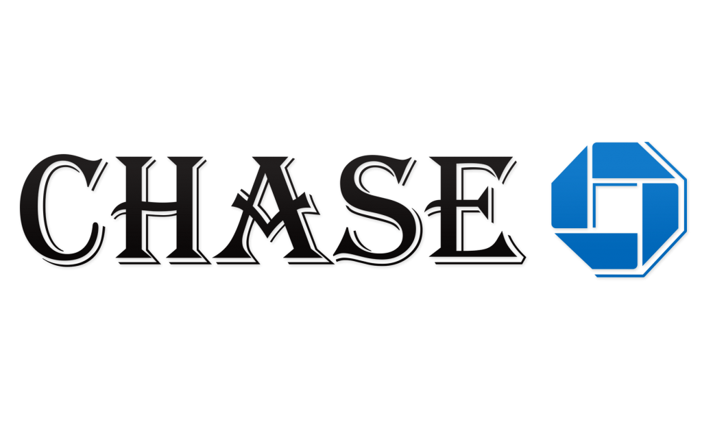
Chase

Chase Logo in Algerian Font

Dell

Dell Logo in Algerian Font

General Electric

GE Logo in Algerian Font

General Motors

GM Logo in Algerian Font

Goodyear

Goodyear Logo in Algerian Font

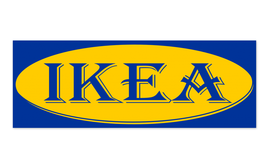
IKEA

Ikea Logo in Algerian Font

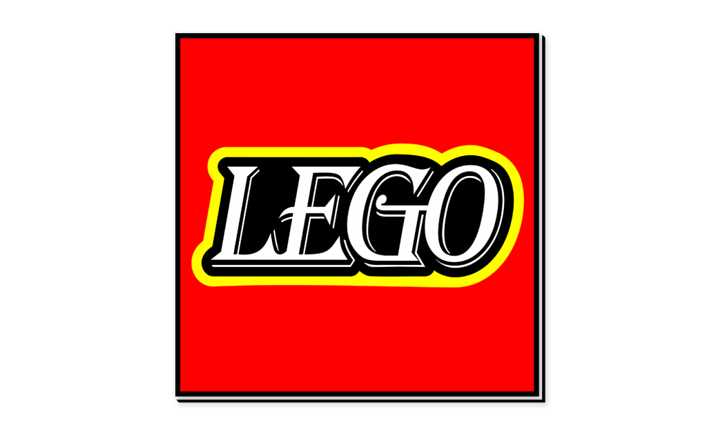
Lego

Lego Logo in Algerian Font

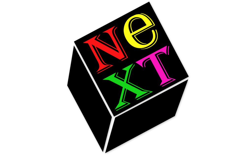
NeXT

NeXT Logo in Algerian Font

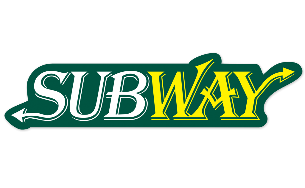
Subway

Subway Logo in Algerian Font

As with the Papyrus redesign, some of the logos look better than others. Best Buy and GM don’t look that different, but GE and Lego are totally off. The other logos fall somewhere in the middle. Overall, the Algerian logos work better than the Papyrus logos I made last week, and Algerian is still leaps and bounds better than Comic Sans. But that doesn’t mean that Algerian isn’t overused. It is. And because of its distinctive letter “A” and its built-in shadowing, it sticks out like a sore thumb to anybody who knows their fonts. There are of good fonts out there that aren’t overused. If you’re starting a new business and want a wordmark logo, I suggest you steer clear of Algerian.

Are there any fonts out there that you really hate? What bad font would be good for redesigning logos? Let me know in the comment section.

Steve Lovelace

Steve Lovelace is a writer and graphic artist. After graduating Michigan State University in 2004, he taught Spanish in Samoa before moving to Dallas, Texas. He blogs regularly at http://steve-lovelace.com.

You may also like...

15 Responses

  1. Mary says:

    These logos hurt to look at.

  2. Dave Wright says:

    Mistral gets my vote.

  3. rileytog says:

    the good year logo it’s fine.

  4. flatts12 says:

    the ikea logo I think.

  5. Mike Perdue says:

    The Subway logo I think.

  6. kayjay says:

    The GM, Goodyear, and NEXT logos honestly look better with the Algerian font. It adds class to the logo

  1. February 4, 2013

    […] while back, I took a series of famous logos and rendered them in the fonts Papyrus and Algerian. Why? Because along with Comic Sans, Papyrus and Algerian really irk graphic designers. All three […]

  2. March 30, 2013

    […] is one of my favorite buildings downtown, since it has a big keyhole in it. Recently, they added a Chase logo to the top left corner, ruining the symmetry of the building. L: The Traveling Man of Deep Ellum […]

  3. July 22, 2013

    […] you like these logos, check out my famous logos in ugly fonts such as Papyrus, Algerian and Jokerman. And if you have any good ideas for more cat logos, let me known in the comment […]

  4. November 15, 2013

    […] I hope you are), you already know of my love of redoing famous logos in ugly fonts like Papyrus, Algerian and Jokerman. For me, there’s something rewarding about distilling a logo or wordmark down to […]

  5. February 13, 2014

    […] Next week: logos in Algerian font. […]

  6. August 2, 2016

    […] letters is even harder than before. Perhaps one day caps will be limited to period fonts and antique signage. Until then, lets make it a little harder to type in all […]

  7. August 2, 2016

    […] feel of a logo. I illustrated this a few months ago by using two widely-despised fonts, Papyrus and Algerian, in a variety of famous logos. The results were pretty hideous. As one commenter on this blog said, […]

  8. August 2, 2016

    […] crosses the line between a serif and sans-serif font. So after redoing famous logos in Papyrus and Algerian, I thought I’d try redoing some famous websites’ logos in […]

  9. March 13, 2017

    […] world and recreates them using a different typeface. The results – which you can view here, here, here, here, here and here – are boring at best and hideous at worst: Pinterest loses its pizazz in […]

Leave a Reply

Your email address will not be published. Required fields are marked *

This site uses Akismet to reduce spam. Learn how your comment data is processed.