Band Logos in Papyrus
I have a love-hate relationship with the font Papyrus. Mostly hate. It’s one of the most overused fonts out there, and while it’s not quite as hated as Comic Sans, it’s arguably worse. Comic Sans, is for the most part, a very readable font. On the other hand Papyrus has blotchy edges and a tiny x-height (i.e. the lowercase letters are much, much smaller than their capital equivalents). Papyrus really is a terrible typeface. But I love playing with it. Like a B-movie, there’s something almost campy about it. That’s why I decided to use Papyrus to render some famous band logos.
Rock bands tend to have serious logos. This is especially true of hard rock and heavy metal bands, whose logos are meant to look “hardcore”. And while there are a lot of bad band logos out there, there are a few with simple and iconic wordmarks. I took these band logos and rendered them in a nice, campy Papyrus font. Here are the results.
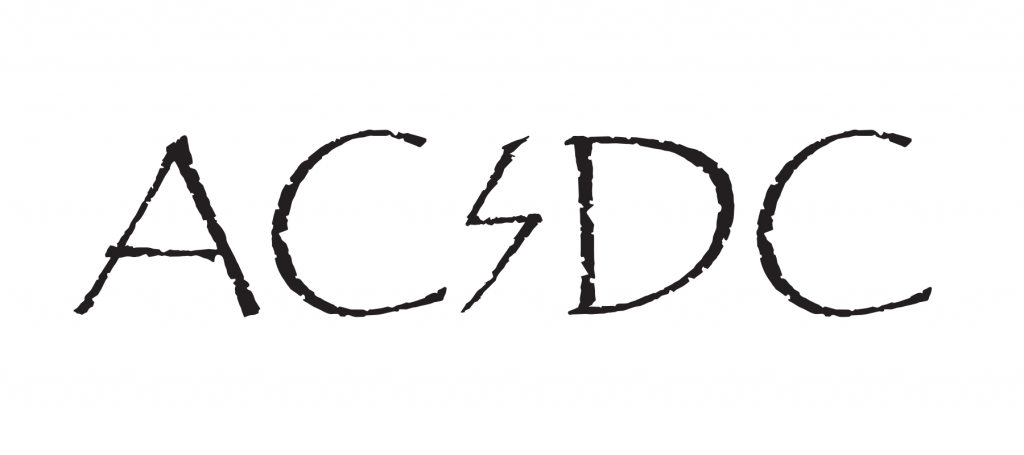
AC/DC
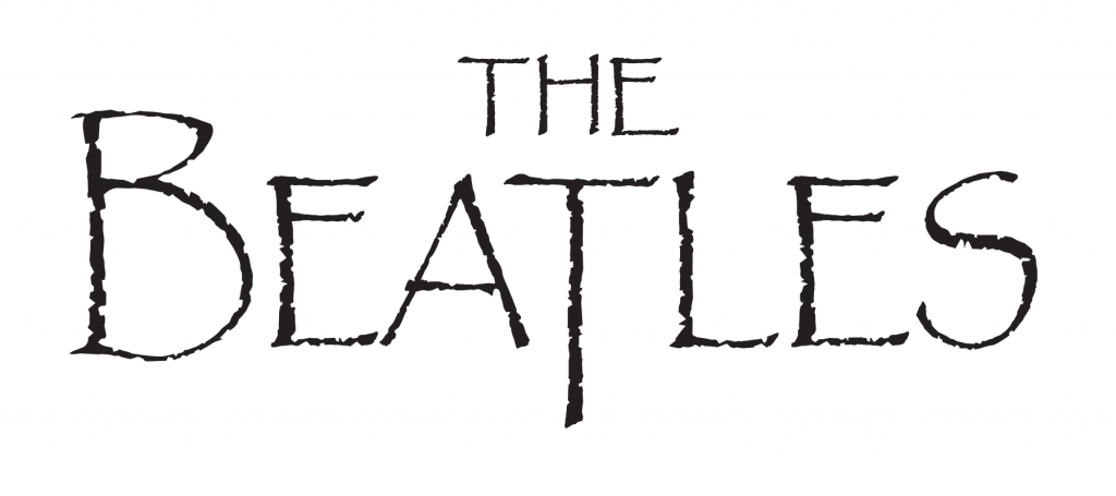
The Beatles
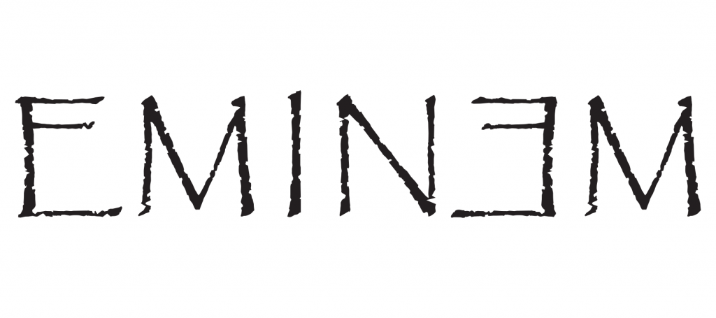
Eminem
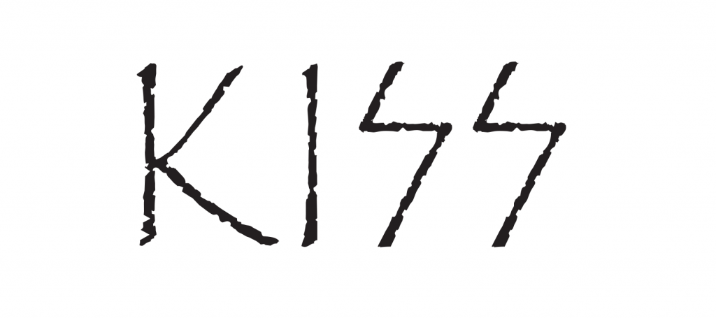
Kiss
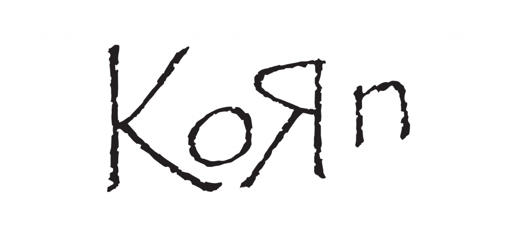
Korn
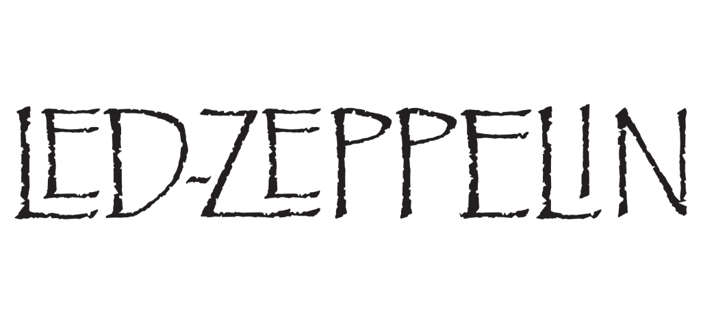
Led Zeppelin
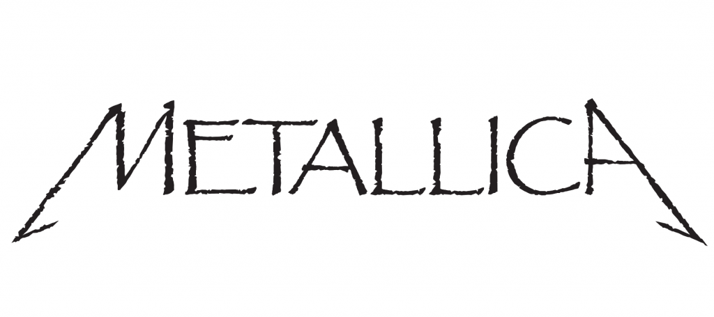
Metallica
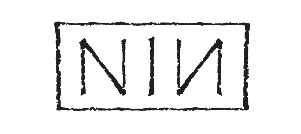
Nine Inch Nails
These were some of the most iconic band logos I could think of, though I’m sure there are many more. Who did I leave out? And if I did this again, what terrible font should I use? Let me know in the comment section.
sucks the soul out of every one of them.
It really does.
Now do lamb of god