Outdated Symbols
Pictograms can be useful for conveying information without text. But they can also go out of date pretty quickly. Such outdated symbols often outlast the very objects they are modeled on. Here are five outdated symbols that are still quite effective.
Neighborhood Watch Guy
 Sometimes on neighborhood watch signs, you’ll see the silhouette of a man in a trench coat and a fedora. I believe this is supposed to resemble a cat-burglar. I think that the hat is supposed to shadow the criminal’s face, but seriously, do any criminals actually dress like this? My guess is that this symbol is a holdover from the days when people always wore cloaks and hats. The problem is, there’s no good replacement. A burglar is an abstract concept to put on a simple sign. The fedora-topped burglar conveys the concept, without ambiguity or stereotyping.
Save Icon
![]() I’m hardly the first person to point out how dated the floppy disk icon looks. These little disks haven’t been commonly used for decades, but they still are represented on just about every save icon on the planet. And with modern apps able to save to a hard drive, a solid-state drive, a USB drive or cloud storage, I don’t see any icon taking its place.
I’m hardly the first person to point out how dated the floppy disk icon looks. These little disks haven’t been commonly used for decades, but they still are represented on just about every save icon on the planet. And with modern apps able to save to a hard drive, a solid-state drive, a USB drive or cloud storage, I don’t see any icon taking its place.
Phone Symbol
![]() The phone app on my iPhone looks like a 1950s handset. I haven’t use the handset like that in years. Even the landline at my work has a much slimmer profile. However, a modern office handset wouldn’t work very well for an icon. The one at my work is just a stick with a nub of an earpiece. The classic Western Electric handset is just perfect for you making a phone icon.
The phone app on my iPhone looks like a 1950s handset. I haven’t use the handset like that in years. Even the landline at my work has a much slimmer profile. However, a modern office handset wouldn’t work very well for an icon. The one at my work is just a stick with a nub of an earpiece. The classic Western Electric handset is just perfect for you making a phone icon.
Women’s Restroom
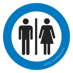 The modern bathroom symbols are known for their simplicity and their universality, but as effective as they are, they’re still a little bit sexist. Or rather, they adhere to the 20th century Western concept of men wearing pants and women wearing dresses. Most women nowadays wear pants, and (heterosexual) men sometimes wear skirt-like garments, like the Scottish kilt or the Samoan lavalava. Though for the most part, these symbols still work, as long as you don’t mind the stereotyping.
Atomic Symbol
 Even as a little kid, I knew what an atom looked like. It was like a little solar system, with the electrons flying around the nucleus. Only in high school that I learned this was a lie. The modern model of the atom has “electron shells” around the nucleus. Thanks to quantum mechanics, the exact locations of the electrons are impossible to determine. Electrons exist in fuzzy little probabilities, according to science that goes way over my head. But this is hard to illustrate, if not impossible. So instead we stick with the little solar system atom. It may not be scientifically accurate, but it communicates effectively.
What other outdated symbols do you still use on a daily basis? Let me know in the comment section.


I am studying graphic design, a girl in my class had to create an icon that symbolized “watching movies” so she drew an old fashioned film projector. I was really interested how well it worked! I also noticed the symbol for message or email is still a paper envelope.