Helvetica
Graphic designers really like Helvetica. For the last 60 years or so, this font has dominated the world of visual communications. If you have an iPhone, you look at it everyday. Even if you don’t, you’re almost guaranteed to see it on everything from nutrition labels to corporate logos. In short, it is the most overused font in history.
A Sacred Cow
Helvetica is a sacred cow amongst graphic artists. It’s the only font I know of with its own feature-length film. I’m not exactly sure why designers have such a fetish for it, but if I had to guess, I’d say it has to do with the way the font is perfectly balanced. It’s well-designed, no doubt, but the real magic is its unobtrusiveness. It’s bland. In short, it’s the perfect lettering for any designer, simply because it doesn’t stand out. That’s why it’s so popular, and that’s why I don’t particularly care for it.
Helvetica vs. Arial
Apple products, from Macs to iPhones, have come preloaded with Helvetica for years. But Microsoft Windows doesn’t come with it by default; it comes with Arial. Arial is similar enough to Helvetica that the average person can’t tell the difference, but it’s different enough that it stands out as an eyesore to font geeks. Arial has the same basic letter forms, but it’s not quite as balanced or as unobtrusive as Helvetica. And that’s why it drives font geeks crazy.
An Overused Font
Helvetica remains one of the greatest typefaces of all time, though I’d really like to see it used less. It’s overplayed, like a six-month-old pop song on the Top 40. Moreover, graphic designers’ reliance on it hinders innovation in typefaces and encourages lazy, bland design. Don’t get me wrong; Helvetica has its place, but there are a thousand other fonts that I would rather use.


I work as a digital printer at a sign place, and my coworker and I were going crazy one week when we printed thousands of signs with some terrible font on it. The reason it was so bad was the letterforms (all capitals) were horribly inconsistent and had awkward shapes. Such as the M and the W and the A. I cant believe I had not recognized it but I finally researched it and it was Helvetica! EEK! I truly had assumed that such an over used font would at least be well designed. NOPE. I have always preferred Arial to Times and Helvetica if we had only the most common fonts available. Calibri has also grown on me. But my favorite font of all time is D’Neilian Cursive.
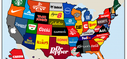
BTW I LOVE your maps!