Book Covers in Comic Sans
Comic Sans is the most reviled font in the world. There are worse fonts, for sure, but Comic Sans has become the most infamous. Today it’s become the “Plan 9 from Outer Space” for typography geeks. Like a bad movie, it’s now enjoyed ironically. Professional graphic designers spend time redesigning things like logos and movie posters in The World’s Worst Font. I’m a sucker for such redesigns, so I thought I’d make my own. Here are some famous book covers in Comic Sans.
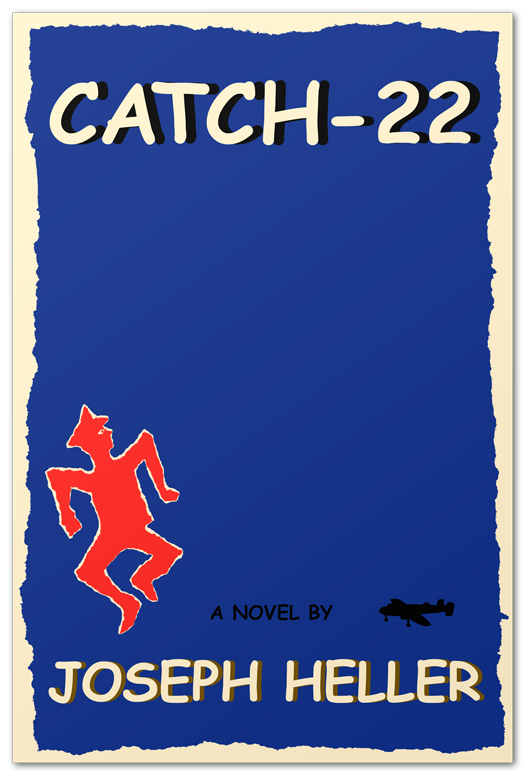
Catch 22
The first book on this list, Joseph Heller’s Catch 22, works alright in Comic Sans. It’s certainly not as good as the original, but it’s better than some of the monstrosities on this list.
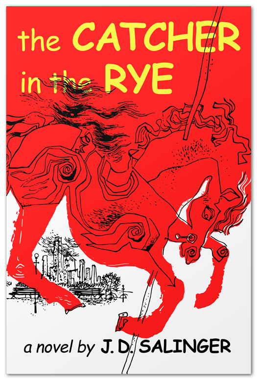
Catcher in the Rye
J.D. Salinger’s masterpiece The Catcher in the Rye looks pretty weird in Comic Sans. Not only does the font not fit the tone of the book, it really clashes with the intricate design below.
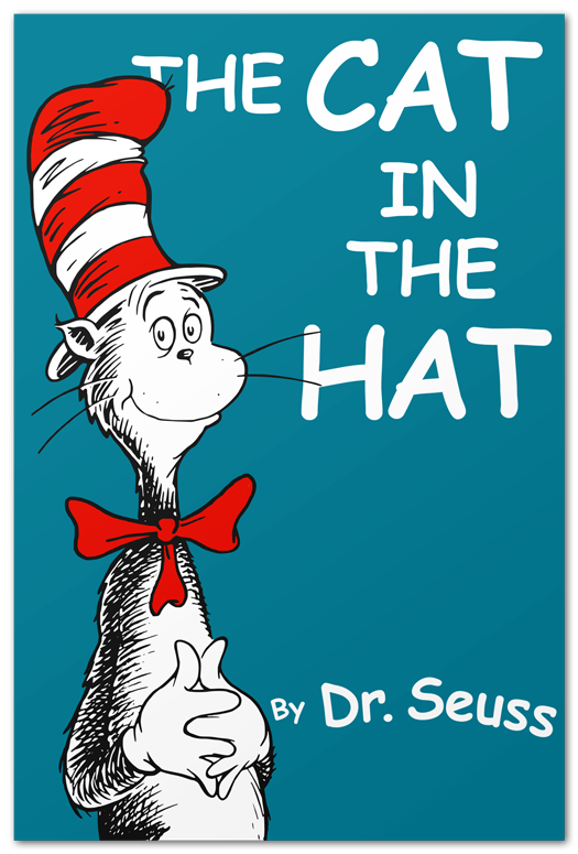
The Cat in the Hat
Dr. Seuss’ The Cat in the Hat could look worse. Comic Sans is mostly appropriate for kids books. Still, as children’s books go, I prefer the rendering of Le Petit Prince below.
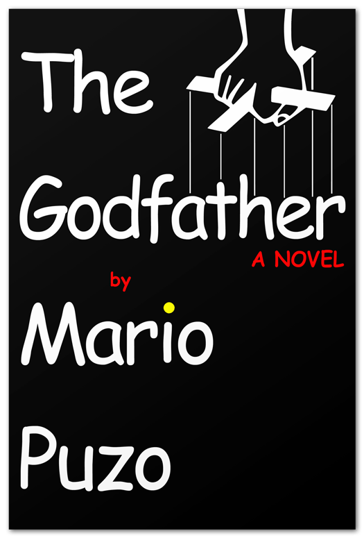
The Godfather
Of all the book covers in Comic Sans on this list, Mario Puzo’s The Godfather is by far the worst. Changing it to Comic Sans obliterates the unique lettering on the cover, and it’s hard to think of a worse font for a gangster novel.
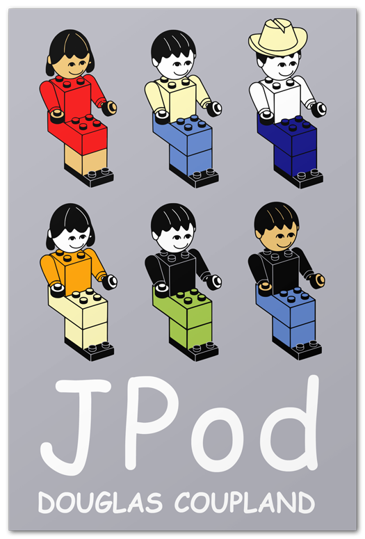
jPod
Douglas Coupland’s jPod is not as iconic as many of the books on this list. But I really like the book, so I decided to include it. Since all the wording is at the bottom, the top half looks normal. But a second glance makes you realize this is pretty bad.
Jurassic Park
This one is almost as bad as The Godfather. Michael Crichton’s Jurassic Park has an iconic cover design by the famous Chip Kidd. Kidd’s T-Rex skeleton design ended up on the cover of this book as well as its sequel and all the movie logos. And it looks bloody awful next to Comic Sans lettering.
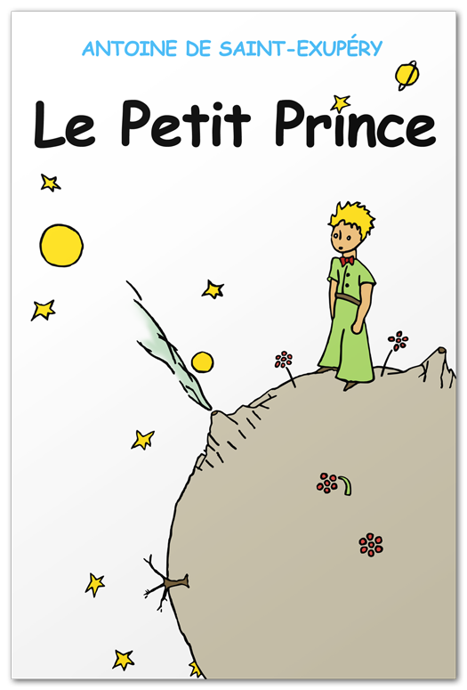
Le Petit Prince
Why limit this list to English-language books? Antoine de Saint-Exupéry’s Le Petit Prince looks pretty good in Comic Sans. It helps that it’s a children’s book, and that the lettering isn’t too big.
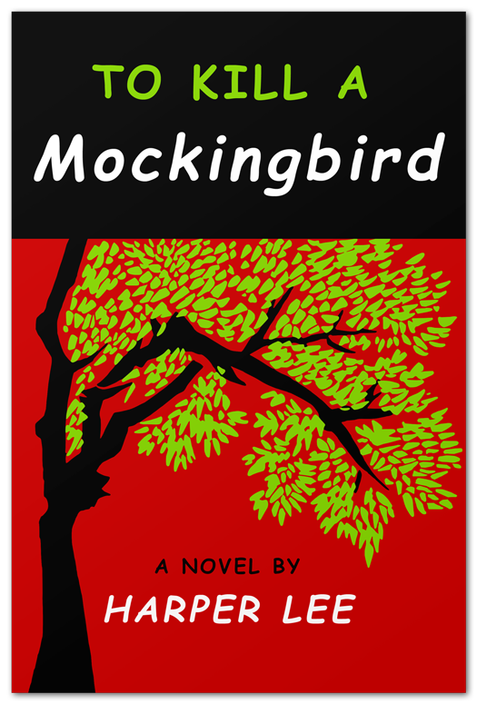
To Kill A Mockingbird
This one surprised me. I was expecting Harper Lee’s To Kill a Mockingbird to be terrible, it actually kind of works. I especially like the all caps part at the bottom. Don’t get me wrong. I’m not saying the publisher should use this design, but it’s not as awful as I expected it to be.
Are there any other book covers in Comic Sans that you’d like to see? Or perhaps some other terrible font. Comic Sans is the most infamous, but there are plenty of others. If you have any ideas, feel free to leave them in the comment section.





The Cat in the Hat works in Comic Sans.