Category: Graphic Design
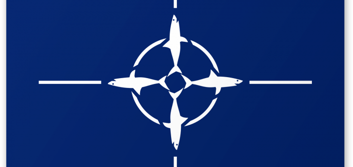
Sharknado vs Shark NATO
The Syfy Channel makes a lot of low-budget movies involving monsters and natural disasters. Their latest monstrosity is a movie called “Sharknado”. As the title implies, it is all about tornadoes full of man-eating...
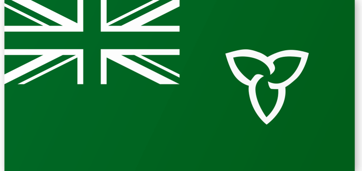
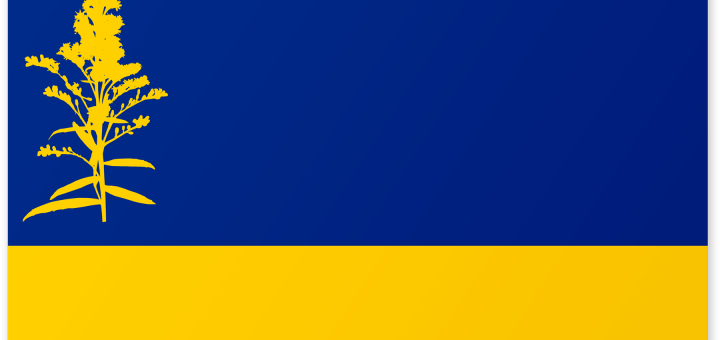
Redesign 101: The Flag of Ontario
About half of the US States the same basic flag: plain designs that feature a seal or coat of arms on an otherwise plain blue banner. This makes it hard to tell apart the...
Famous Logos in Wingdings
Wingdings is an unusual font. Unlike Helvetica, Papyrus or even Jokerman, it’s not a font that uses letters. Instead it’s what’s called a dingbat font. Dingbat fonts date back hundreds of years, to ornamental...
Tech Logos in Chicago Font
The designers of the original Apple Macintosh faced a challenge. They wanted a computer with beautiful and proportionate fonts, but with a small black-and-white screen, the graphics were still quite limited. Thankfully, Apple had...
Redesign 101: The Flag of Nebraska
What’s the worst flag in America? There are some pretty bad ones out there. City flags, in particular, tend to be badly designed. But let’s stick to state flags for now. When it comes...
The Fallout Shelter Sign
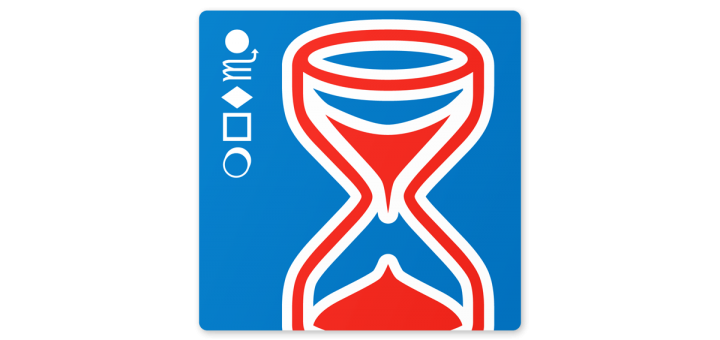
It is one of the icons of the Cold War: the fallout shelter sign. In an age where global thermonuclear war was just an inch away, the United States Government had to find a...
Liberty and Marriage Equality
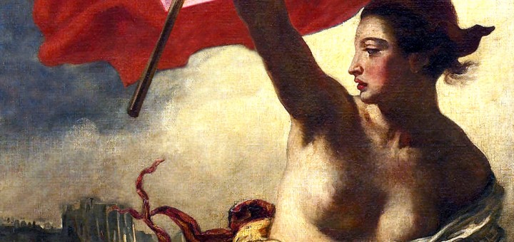
I’m not the kind of person to change my Facebook picture for various causes. Sure I want to cure cancer and feed starving children, but changing my profile picture isn’t going to help. When...
Famous Logos in Jokerman Font
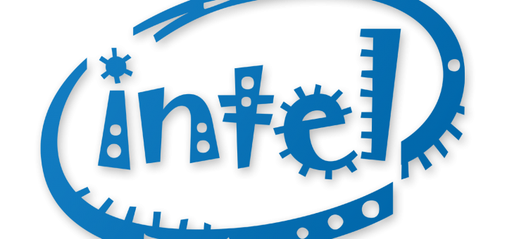
You’d be amazed at the difference a font can make, especially one used in a wordmark or logo. Just using a different style of lettering can completely change the feel of a logo. I...
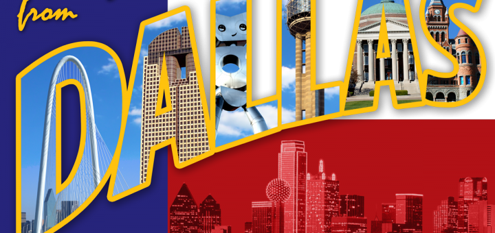
A Dallas Postcard
I love the old postcards where the letters are filled with local landmarks. A few months ago, I created one for Springfield, Illinois. Ever since then, I’ve wanted to create one for my adopted...
