Rebranding Failures
![]() You don’t own your brand.
You don’t own your brand.
This is something that a lot of companies forget. You see, branding is meant to appeal to people on a primeval level. Modern corporations use brands and logos the way feudal lords once used banners and shields. Once you’ve hooked someone into your “tribe”, you’ve got a loyal customer for life. However, these loyal customers demand something in return. By treating them like members of the tribe, you make them stakeholders in the brand identity. When you mess with that identity, you risk angering the members of your tribe.
One of the most recent examples of this is the Netflix/Qwikster rebranding. What makes this such a fiasco is that Netflix is deliberately creating a failing company. When they say that their old business model of mailing discs is dead, then spin that “dead” business off into a separate company with none of the Netflix branding, they are by extension insulting their customers. People who have known and loved the Netflix disc-mailing service for years now feel like fools for signing up with the service in the first place.
The Perils of College Branding
God help the graphic designer responsible for rebranding a university, especially one with a long and proud tradition. Loyalty to one’s school is second only to loyalty to one’s country. You might was well be charged with redesigning Old Glory. Or worse, the flag of Texas. (A flag which is damn near perfect as it is.)
I’ll use my own alma mater, Michigan State University, as an example of college rebranding gone awry. In January 2010, the university tried to redesign the Spartan helmet logo. The changes were subtle: the eyes were made “meaner” and the crest of the helmet was simplified. The outcry from students and alumni was far louder than anyone at the university ever expected. After a vocal opposition from across the social media spectrum, Michigan State relented and kept the old logo.
While the new Spartan helmet (thankfully) failed, Michigan State’s marketing department has not stopped trying new things. For the upcoming game against arch-rival Michigan, they’re changing the uniforms from Green and White to Green and Bronze. By trying it out for a single game, they can test the waters without riling the die-hard Spartans. And while, at least from my Facebook and Twitter observations, I think the new uniforms will flop, I’ll at least give them credit for trying something new.
 Copying Kinko’s
A couple of months ago, the FedEx Office by my house put up a sign in saying “Kinko’s Copying Inside”. Not only that, but the word Kinko’s was written in the using the old Kinko’s word mark, not the modern FedEx branding. This is a kludge if I’ve ever seen one. Yet I understand why they put such a sign up in the window. When FedEx bought Kinko’s back in 2004, they changed the name to “FedEx Kinko’s”, with an emphasis on the “FedEx”. A couple of years later, they dropped the “Kinko’s” from the name. The problem is, six years after the acquisition, people still call it Kinko’s. When was the last time you heard someone say they’re running down to “FedEx Office”?
A quick query on Google Trends shows that, five years after merger, Kinko’s has much higher name recognition that FedEx Office. This is a prime example of a corporation not owning its brand. Despite years of co-branding, FedEx has been unable to shake the ghost of Kinko’s. If management and shareholders of the company have any sense, they’ll revert back to the Kinko’s name, not as a paper sign in the window, but as a neon sign above the door. After all, if ten million people call you business a certain name, maybe you should just run with it.
Hit the Road, Jack
When I was a kid, I remember Jack in the Box briefly changing their name to “Monterey Jack’s”, with Ray Charles singing the new name of the restaurant to the tune of “Hit the Road, Jack. (Though I am unable to find a video clip of that particular commercial.) At the time, Jack in the Boxes in some markets (such as St. Louis and Seattle) switched over from the red Jack in the Box logo to a blue “Monterey Jack’s” logo that fit in the same cube-shaped signs. Then, almost as quickly as they appeared, the Monterey Jack’s all disappeared, fading overnight into regular old Jacks in Boxes.
A couple of years ago, I looked up Monterey Jack’s online and found nothing. I thought that maybe I had dreamt the whole thing. A more recent Google search showed that I am not insane (at least in that regard), but several other people online who thought it was all a dream as well. The whole campaign was so short-lived that it barely had time to make a dent of the collective memory of civilization. In this case, I have to give mad props to Jack in the Box for trying the rebranding out on a limited scale and discontinuing it when they realized it wasn’t going to work. The fact that it’s so hard to find anything about it online is a testament to how well the whole thing was handled.
Take a Risk
Rebranding is a tricky exercise. Given all of the cautionary tales I’ve just told, it would be easy for marketers to never rebrand and never innovate. This too is a losing proposition. While watching a recent Michigan State football game, I noticed that the block letters on the field had little triangular notches in the top inside corners. As an alum, my first thought was “that doesn’t look like it did when I was in school, but as a graphic designer, I thought it looked pretty damn good.
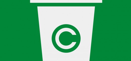
I felt the same way when Starbucks changed their logo earlier this year. At first I hated it, but then I realized I was just being averse to change. Now I really like it. Then there was Pepsi’s rebranding in 2008. Back then I thought that the logo looked like a plumber’s rear end, and while I’m not too fond of it, Pepsi has pulled it off pretty well. This is innovation done well. But that’s the hard thing about creativity and innovation. You never know what’s going to fly until you test it out “in the wild”. That’s why I’m a fan of rebranding and trying new things. For when it comes to marketing, stagnation is the cardinal sin.


3 Responses
[…] rebranding: Graphic design geeks like me might care about your new branding guidelines, but it’s not […]
[…] it or not, virtually everyone hates the lack of a Start Button on the desktop. Like Kinko’s changing its name to FedEx Office, people just won’t accept the […]
[…] name and design at first. But as these regional companies merged into national conglomerates, they rebranded with new, non-Bell identities. A few companies, like Bell Canada and Cincinnati Bell, still use the […]